All posts by beta_trader


Random thoughts

banner-randomness


Dear little Google bot, I would like to thank you for your loyalty. I’ve been busy these past months, I forgot that I had this unsightly website, I was not there to take care of you but you were always there for me. You’re such a good and reliable friend. A bit shy and silent friend maybe but you’re still a friend.

As a Naked trader, I like to trade the market with high-probability setups as every bot can see on this thing called website. I chose to rely on the entry setups in order to have an edge on the market and earn money over the long run.

Why ? As everybody, I like to be right. I love picking my setups accurately with a lot of patience. So, I studied a lot of market theories, market models, market patterns in order to ensure that I’m right more often than being wrong. My experience and my track record showed that it’s possible to have an edge on the market in order to gather money with consistency. But this means that the Market tend to be predictable in some instances.

Is it really the case ?

One efficient way to test your strategy and your beliefs about the markets is to backtest it over and over to confront your concepts against it. I found that every backtesting software on the market are… pretty lame in my opinion, including  the well-known Forextester. In these conditions, I started to design my own backtest software, being sure that it will suit my needs and allows myself to test everything I want very quickly.

At the very start of my backtesting software developping stages, I had to handle some random data to check the display of my software. No matter the substance, only the form was the focus. So I used the following light algorithm to produce random data ensuring the display is what I wanted :

for (int i = 0; i < 5000; i++)
{
double x = xDate.XLDate;
double close = (open + rand.NextDouble() * 10 – rand.NextDouble() * 10);
double high = (Math.Max(open, close) + rand.NextDouble() * 5);
double low = (Math.Min(open, close) – rand.NextDouble() * 5);
open = close;
[…]
}

There is no need to be used to read IT code like this to understand,  it’s not complex. These lines generate randomly 5000 candles and the open, close, low and highs are randomly generated. The close of the next candle is composed by the open of the previous + a random number between 0 and 10 – a random number between 0 and 10. Thus, the charts are supposed to display random and chaotic data but it doesn’t matter because the purpose is to check display quality.

There is something important to notice here : to be accurate, the data are not “random” but “pseudo-random”. Why ?

In fact, in IT field, the term “random” is very special because we like accuracy. The pure randomness doesn’t exist (it’s just that the number of implied factors in an event is too high for our mind). If we want pure randomness in IT, we have to use specific hardware to have true entropy.
When you have to conduct some specific IT audits in order to assess the security and the compliance of very big companies, the aim is to be sure that betting and poker online websites for example, cannot be easily hacked and being sure that the randomness (during a poker tournament for example) is “reliable”. These companies have to pay specific devices like that for instance (using atmospheric noise for randomness for example or quantic mechanic) to have true randomness.

If we use the standard randomness of a computer, it’s not enough to have true entropy (standard software often use several elements like mouse position, CPU temperature, OS information, …).
So it’s important to understand that these data generated on a simple Personal Computer are not purely random, they are “pseudo-random”. It’s called like that in IT field.
A lot of information is available on this particular topic.

So we will call “pseudo-random” data (almost equal to random but not purely random) for the data generated by my software.
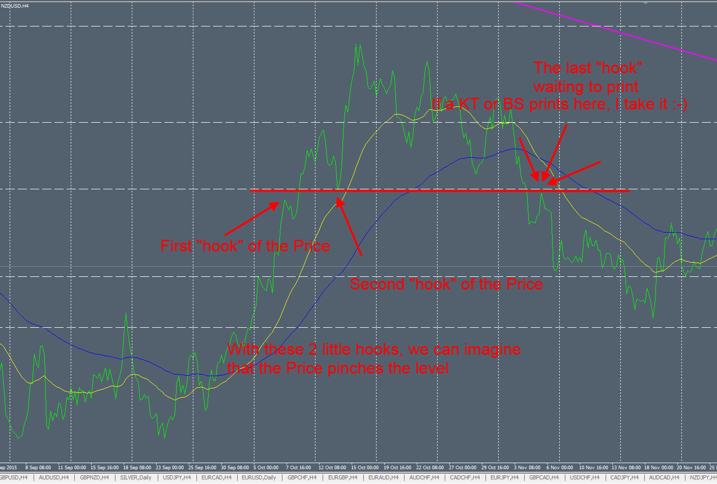
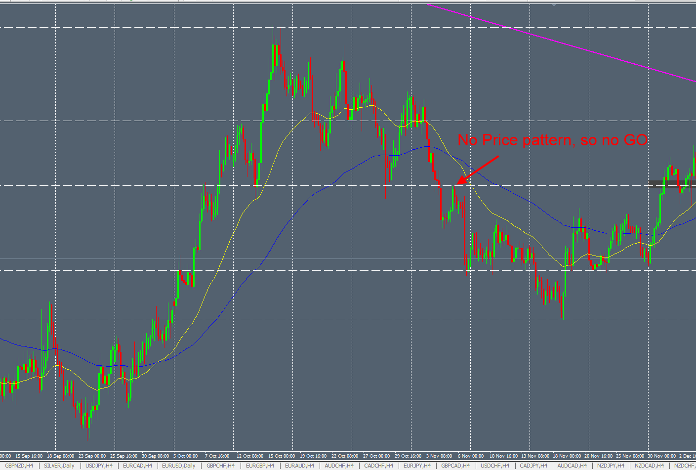
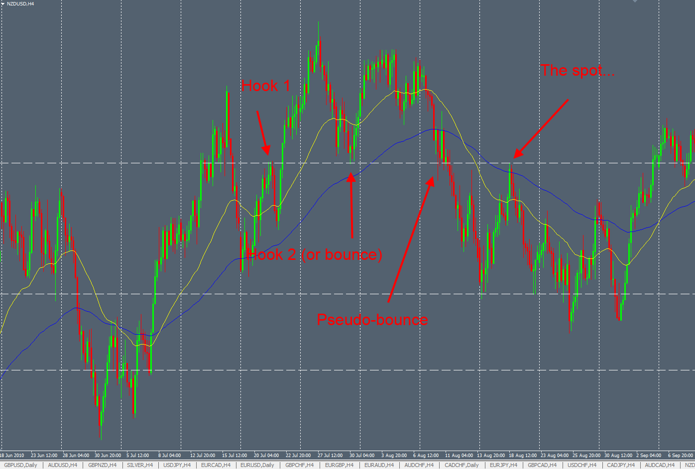
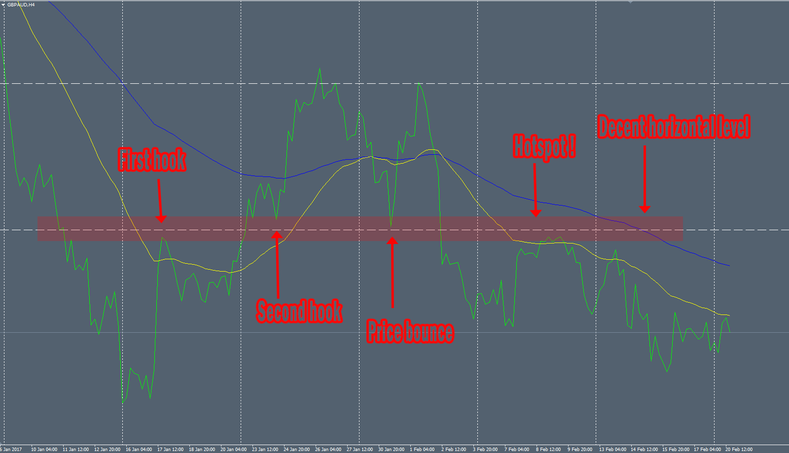
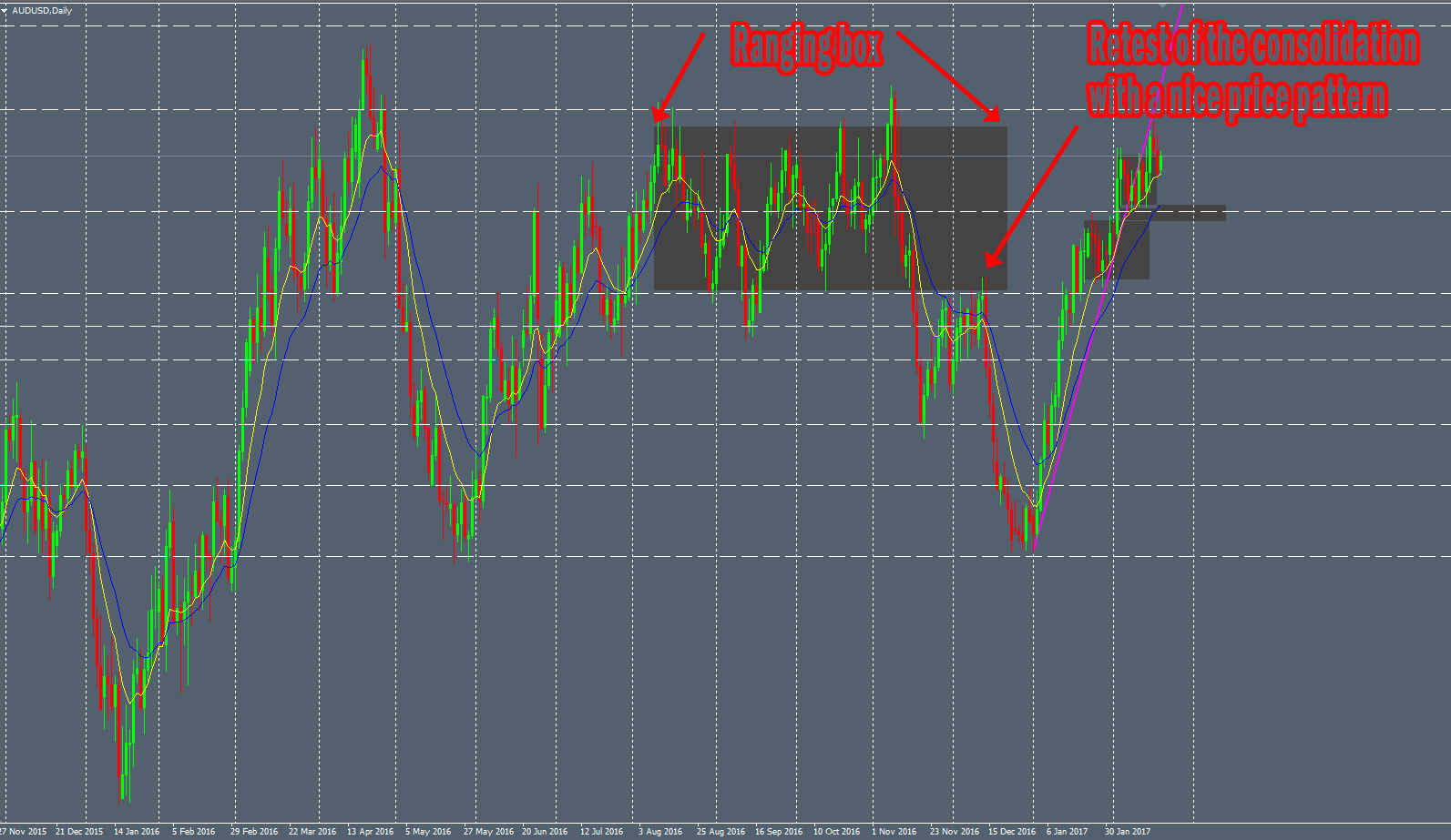
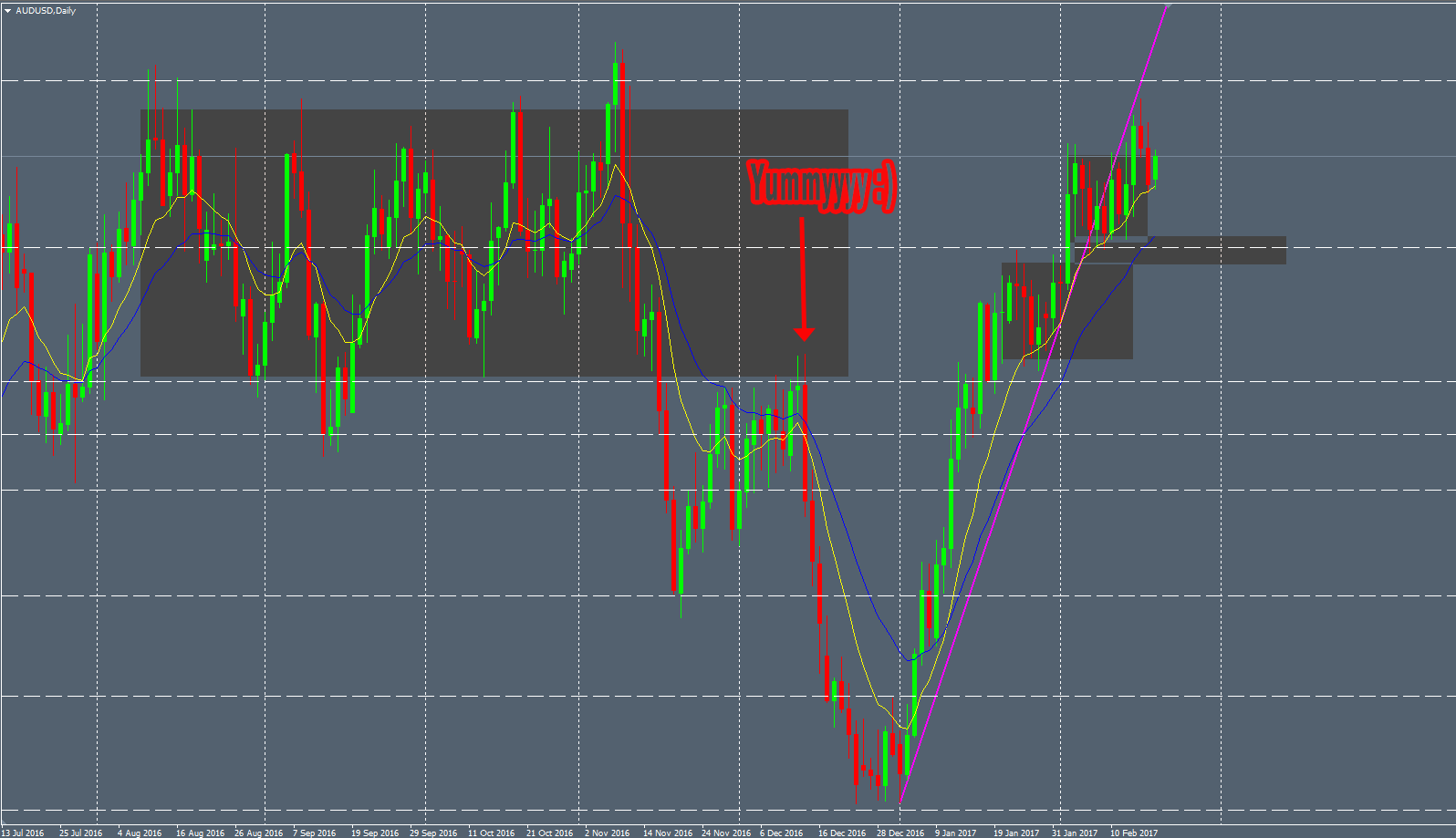
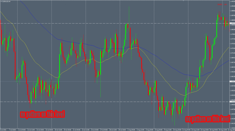
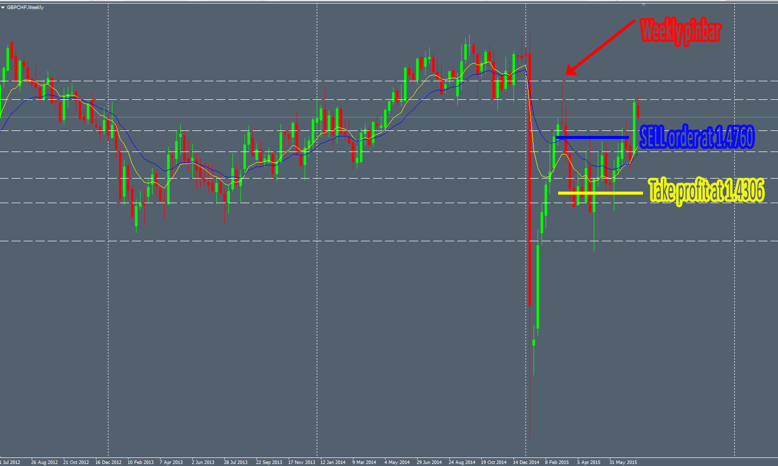
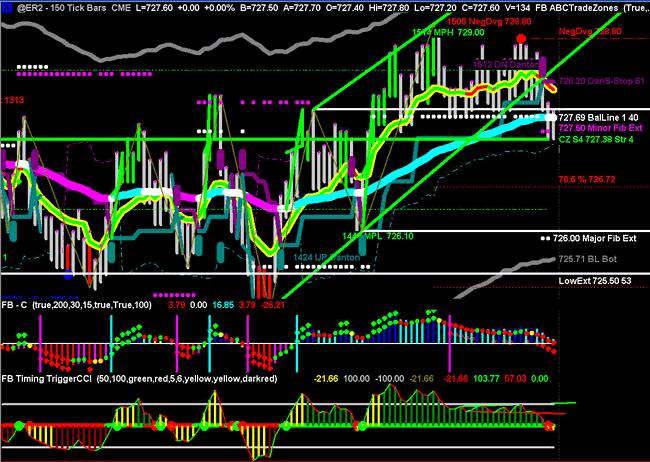
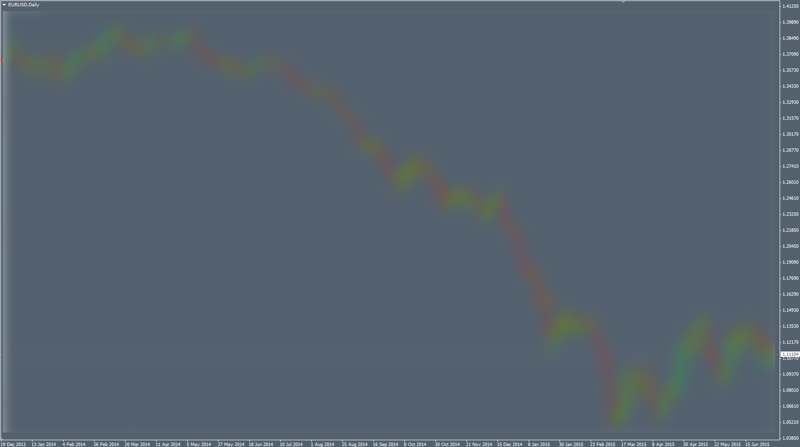
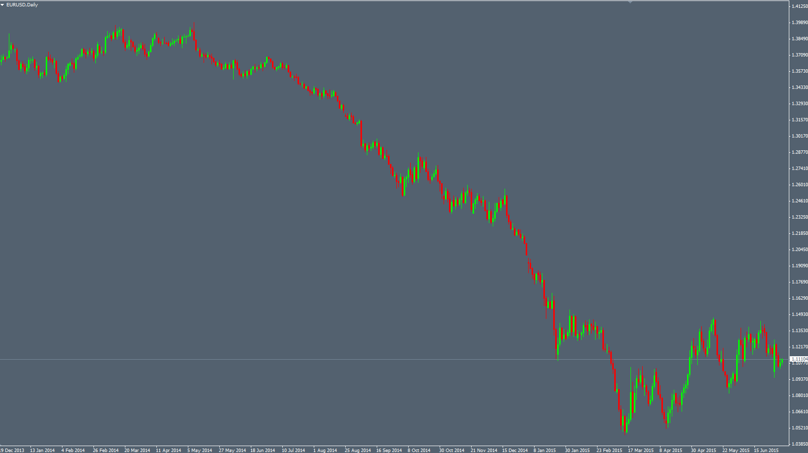
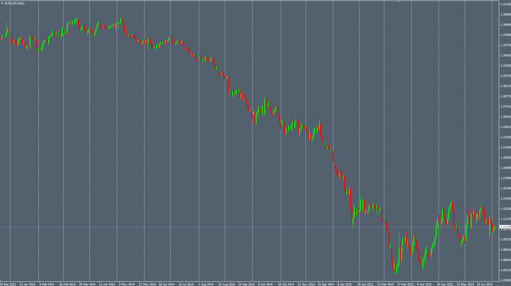
Now, here’s what can be seen as disturbing. Some screenshots of the data displayed with Japanese candlestick patterns from this “pseudo-random” data:

random-5

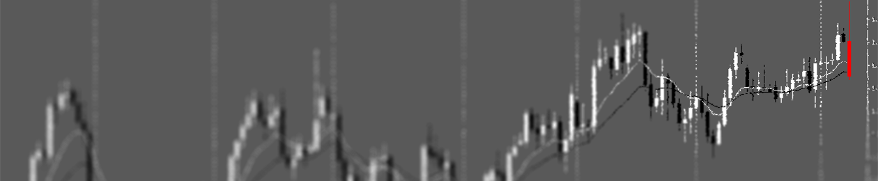
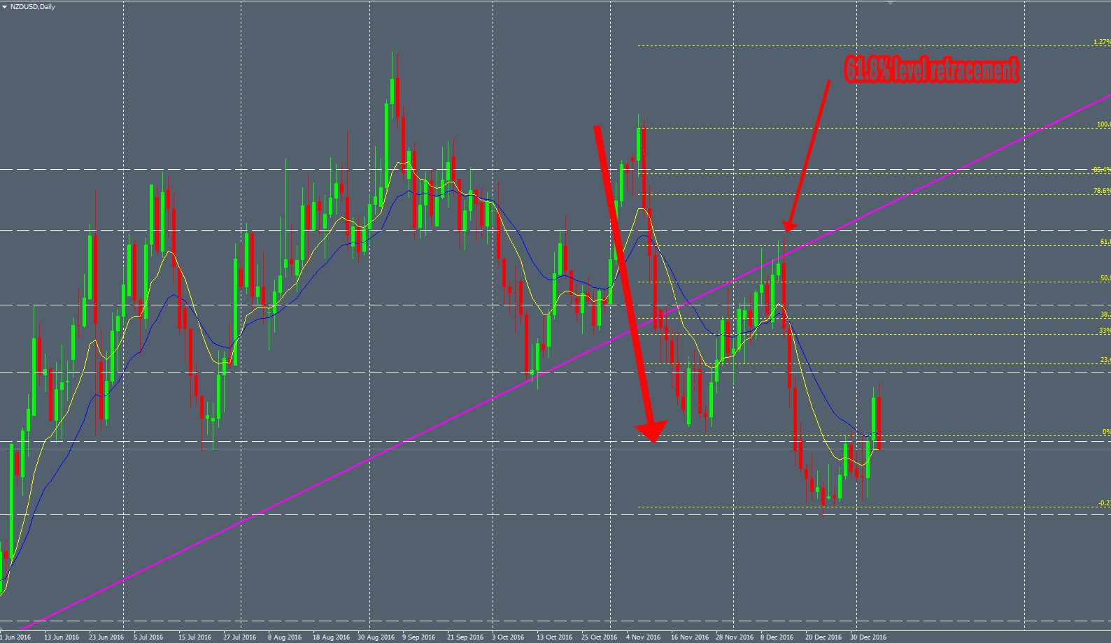
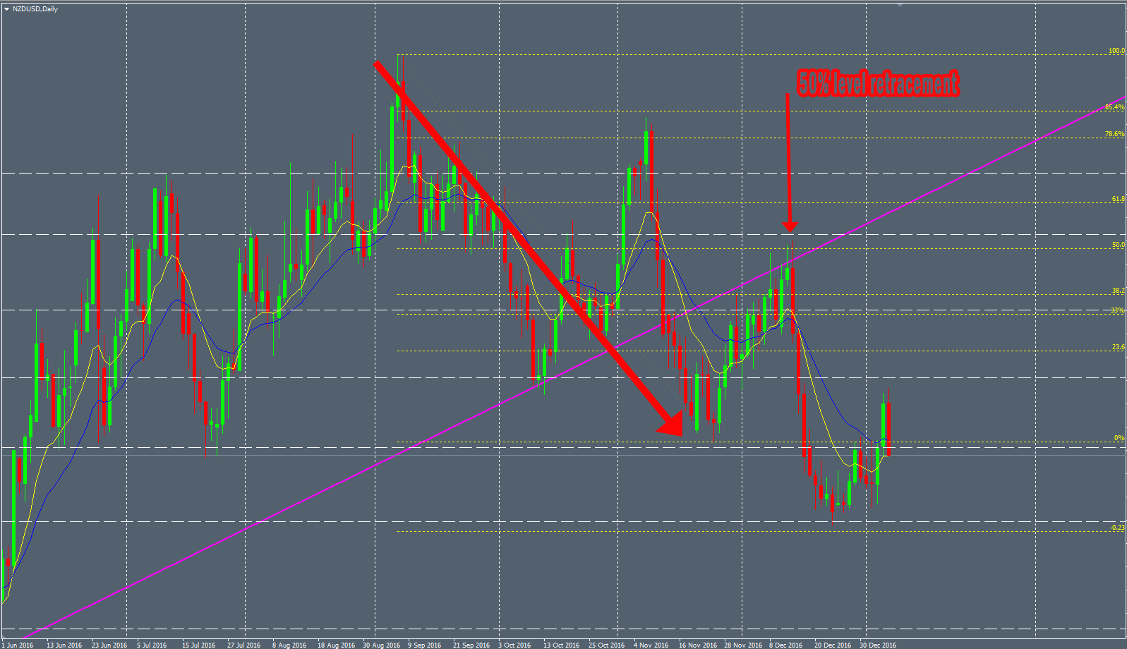
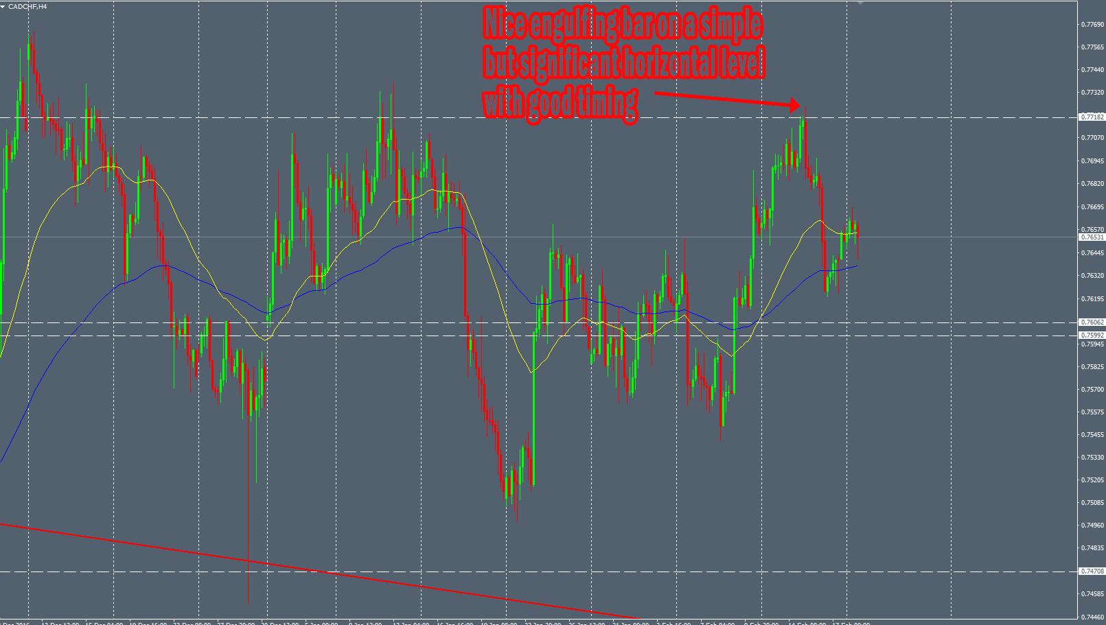
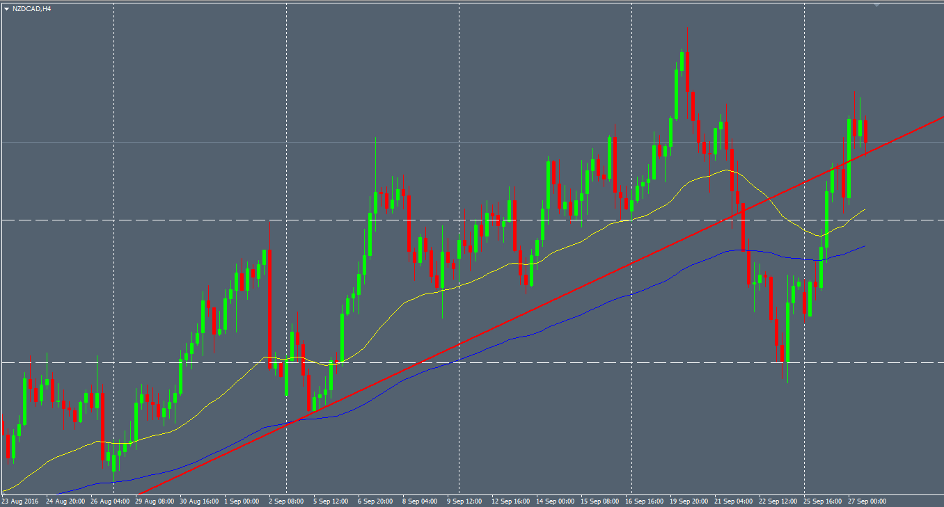
Here, we can see that the “pseudo-random” data tends to form a consolidation zone like the real price on the market. On the right, we can even see a price “retest” before collapsing.


random-4

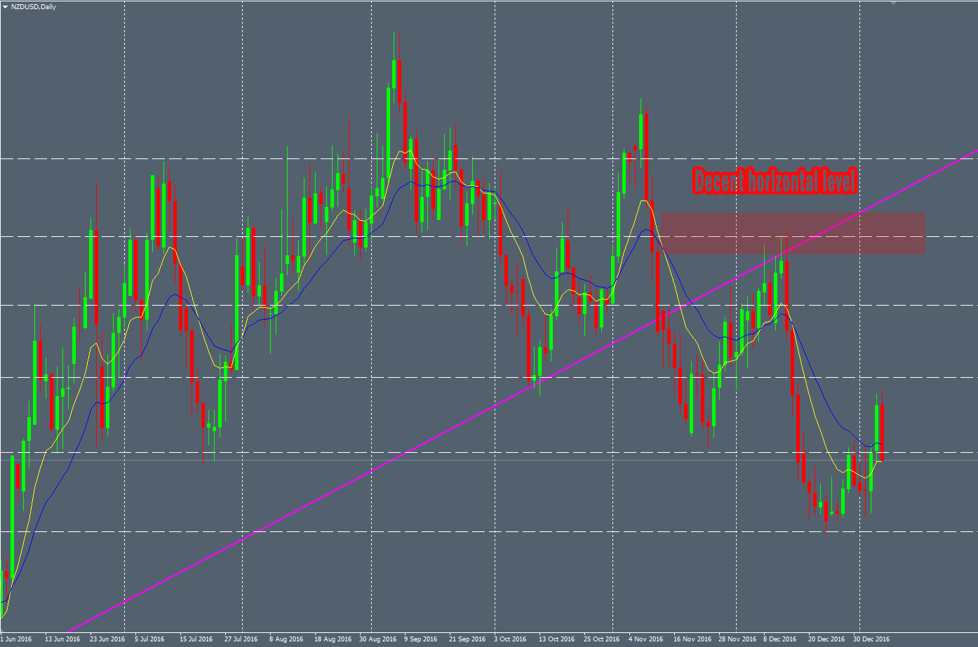
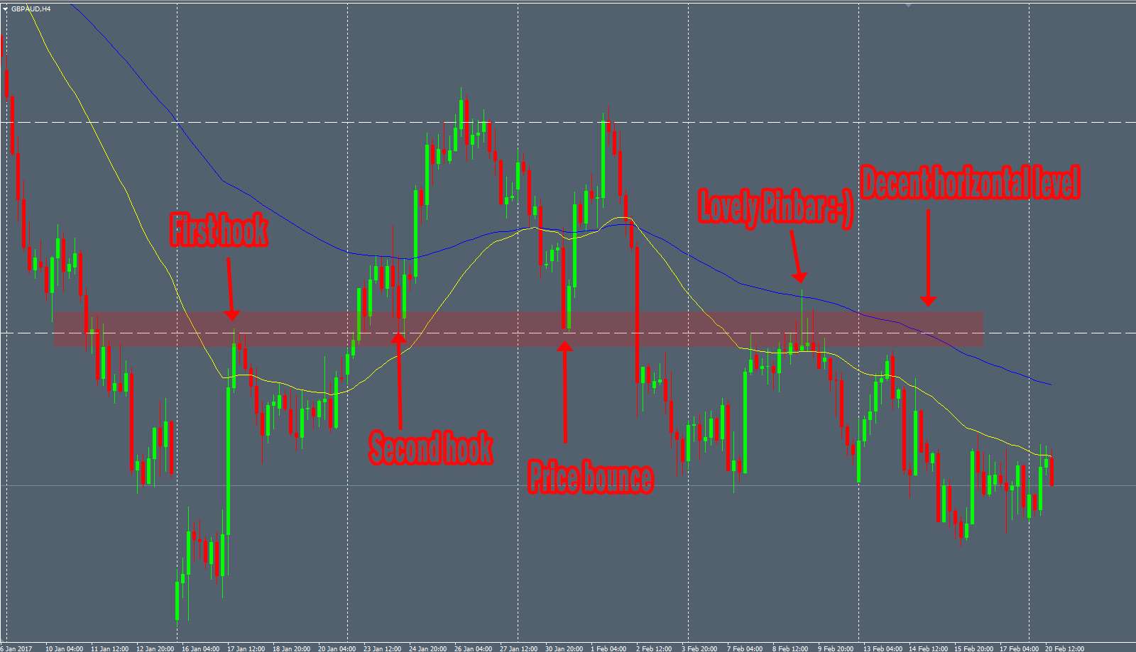
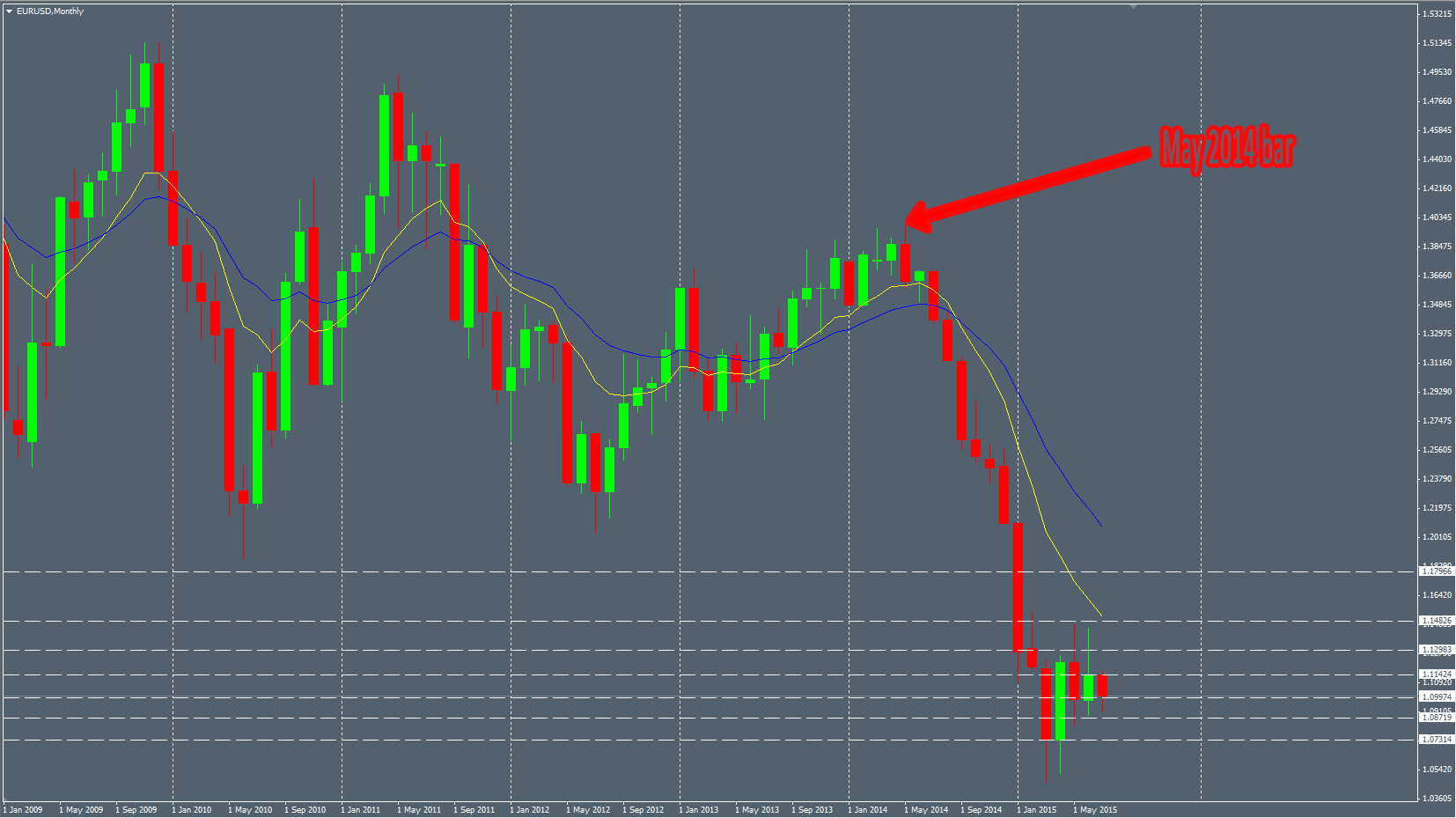
Above, we can distinguish some kind of Support/Resistance horizontal line. The price interacts with it and bounces on it. If I didn’t explain that it’s pseudo-random data, we could think it’s just a Price fluctuating on some major Forex pairs for example.


random-3

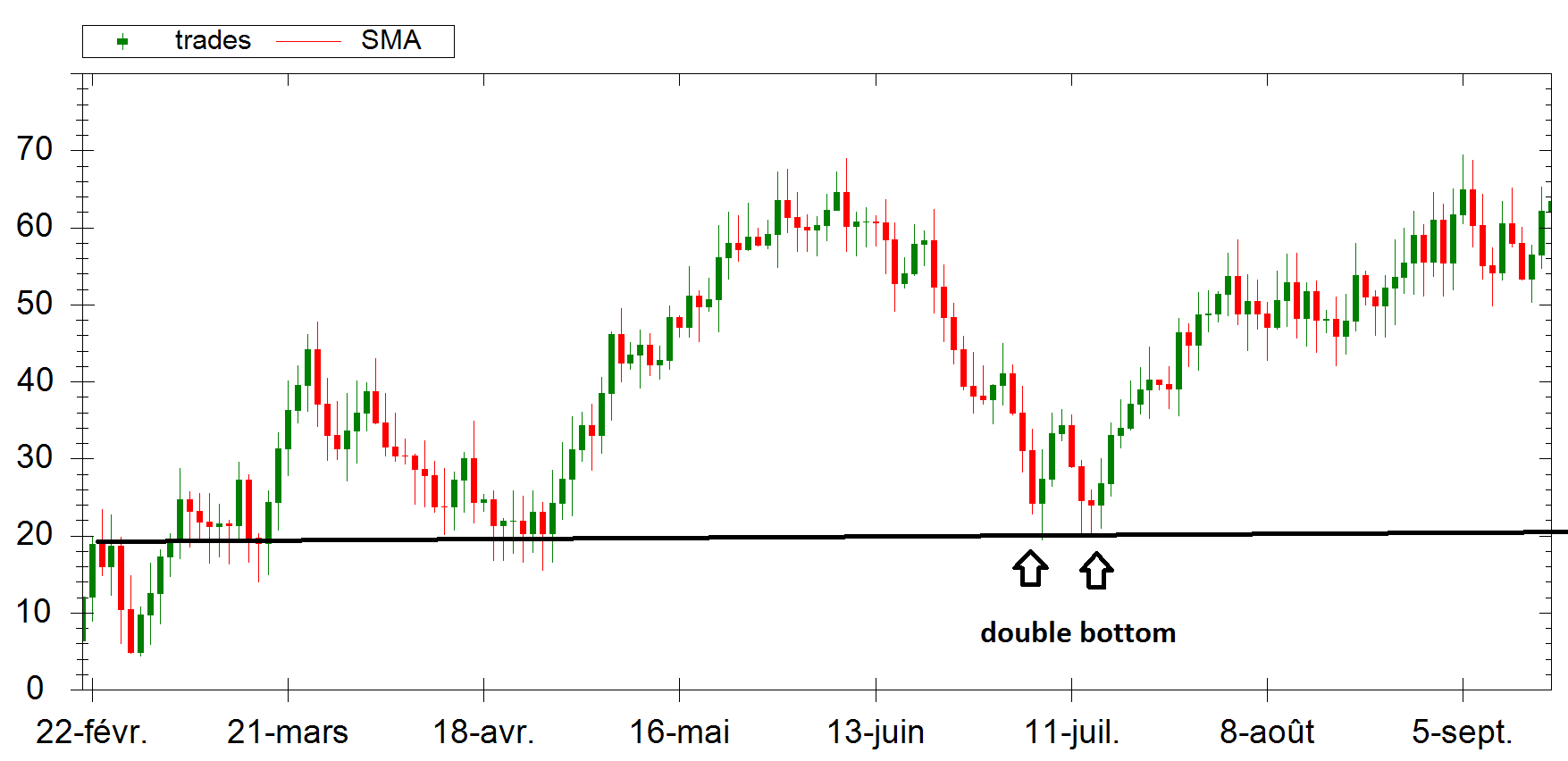
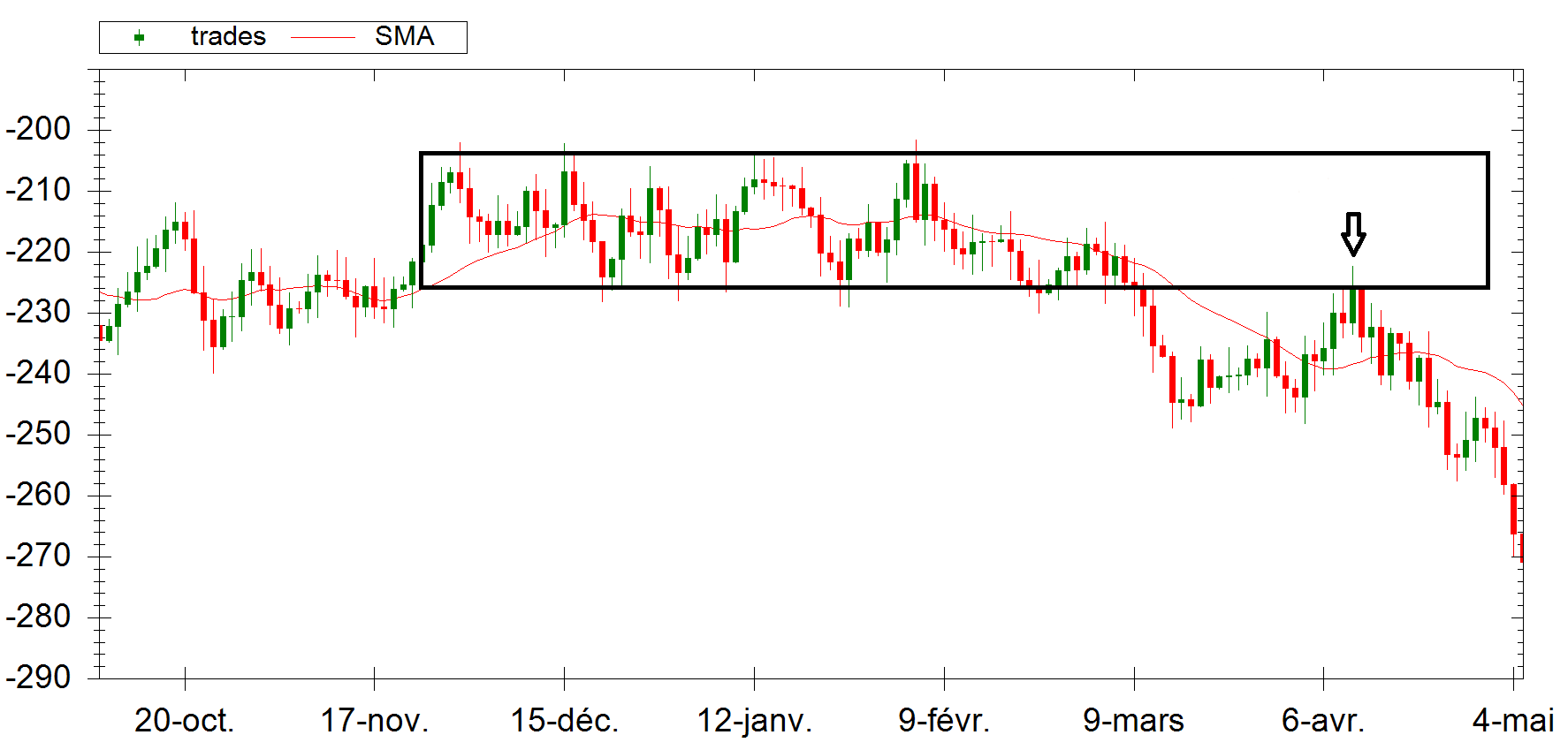
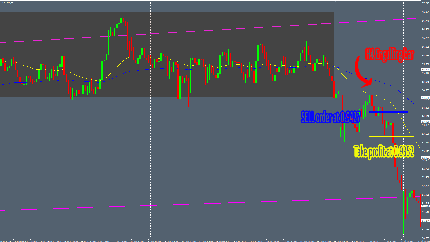
Here is another example of Support interaction of the Price with a nice “double bottom” pattern. This is “tradable”.


random-2

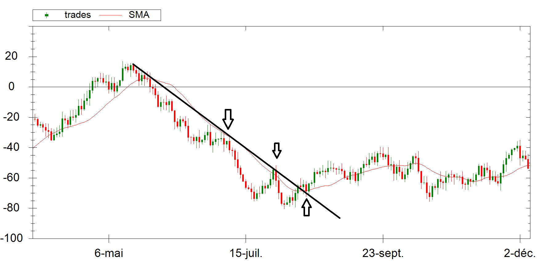
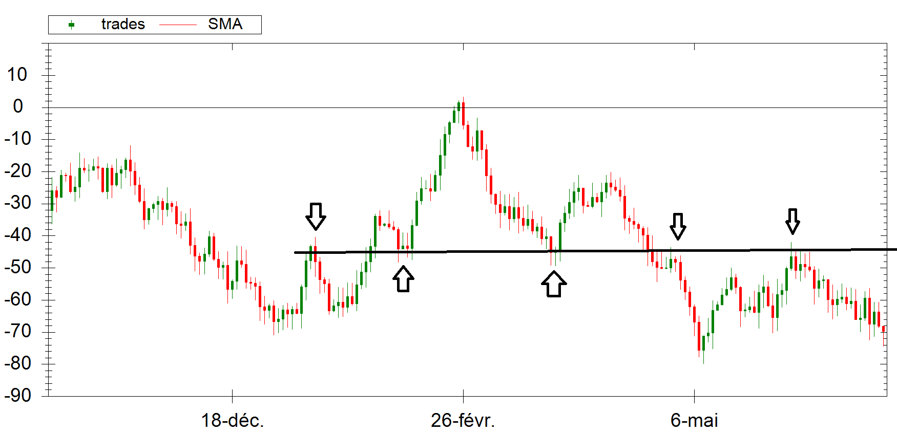
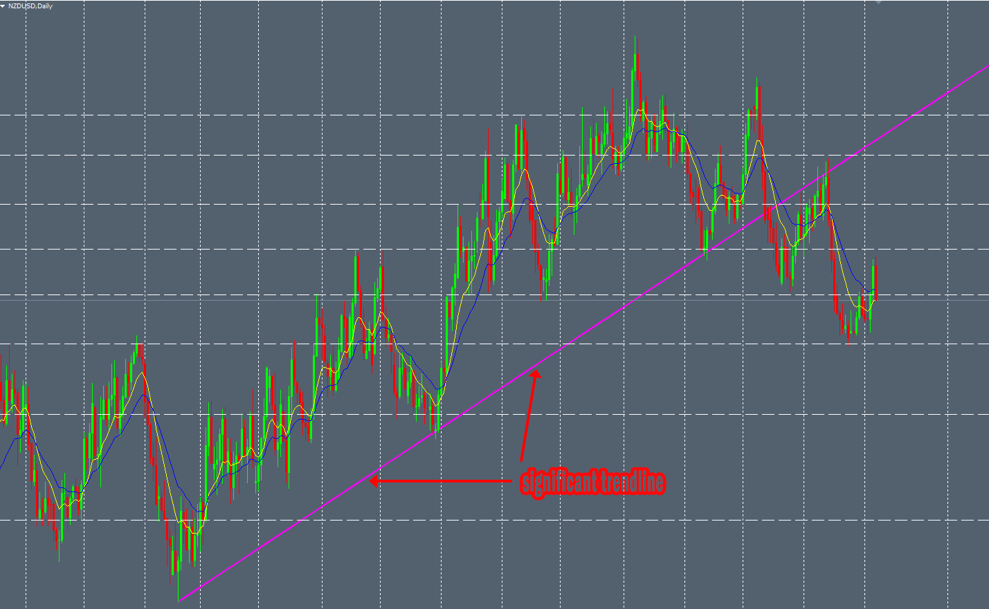
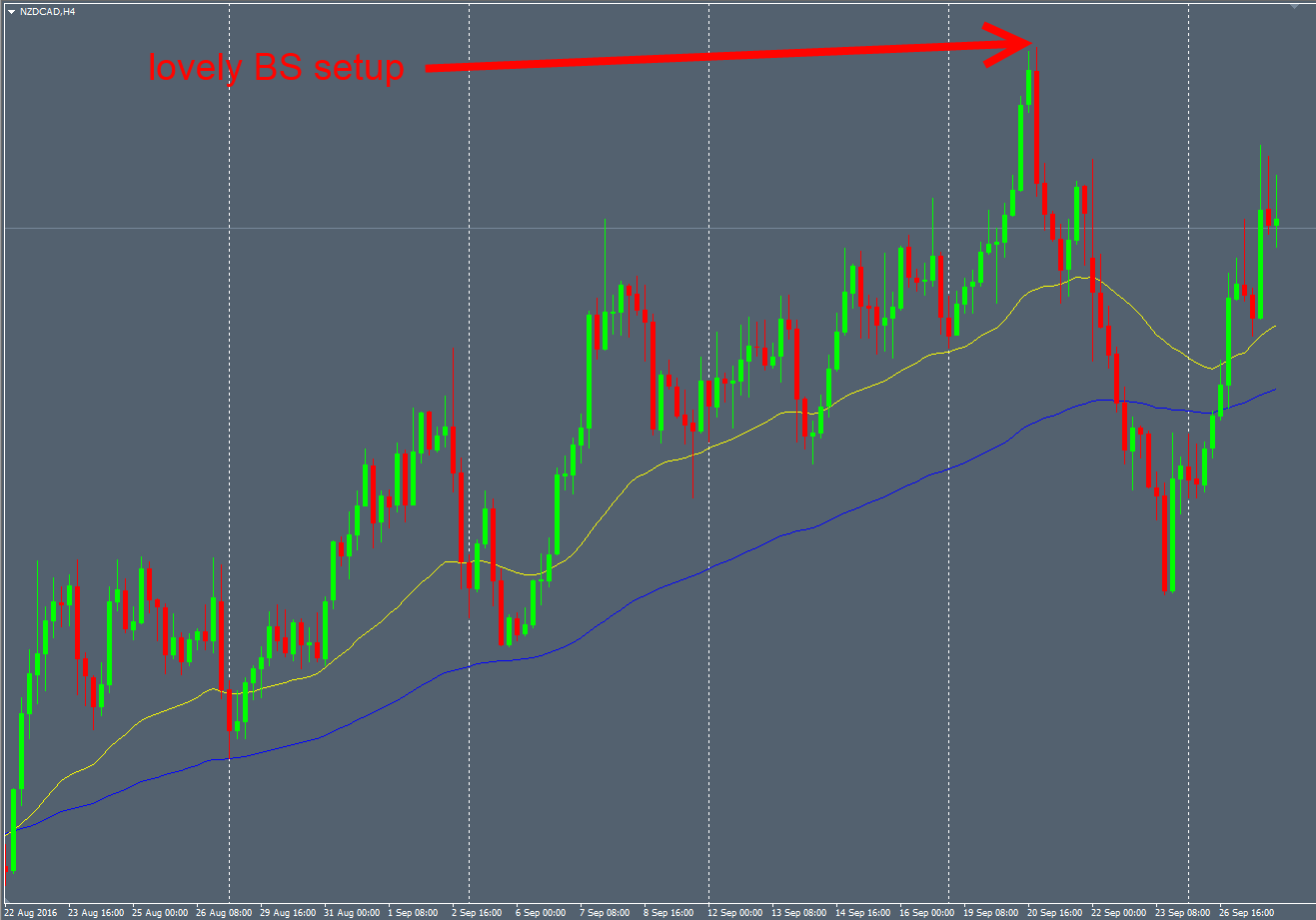
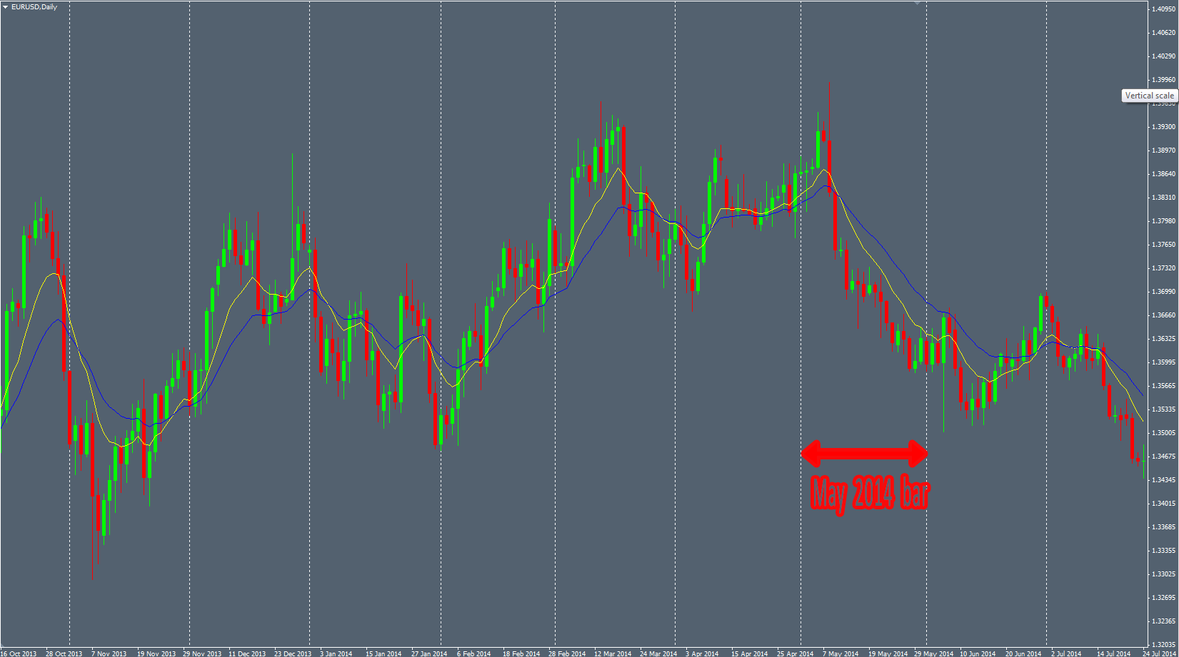
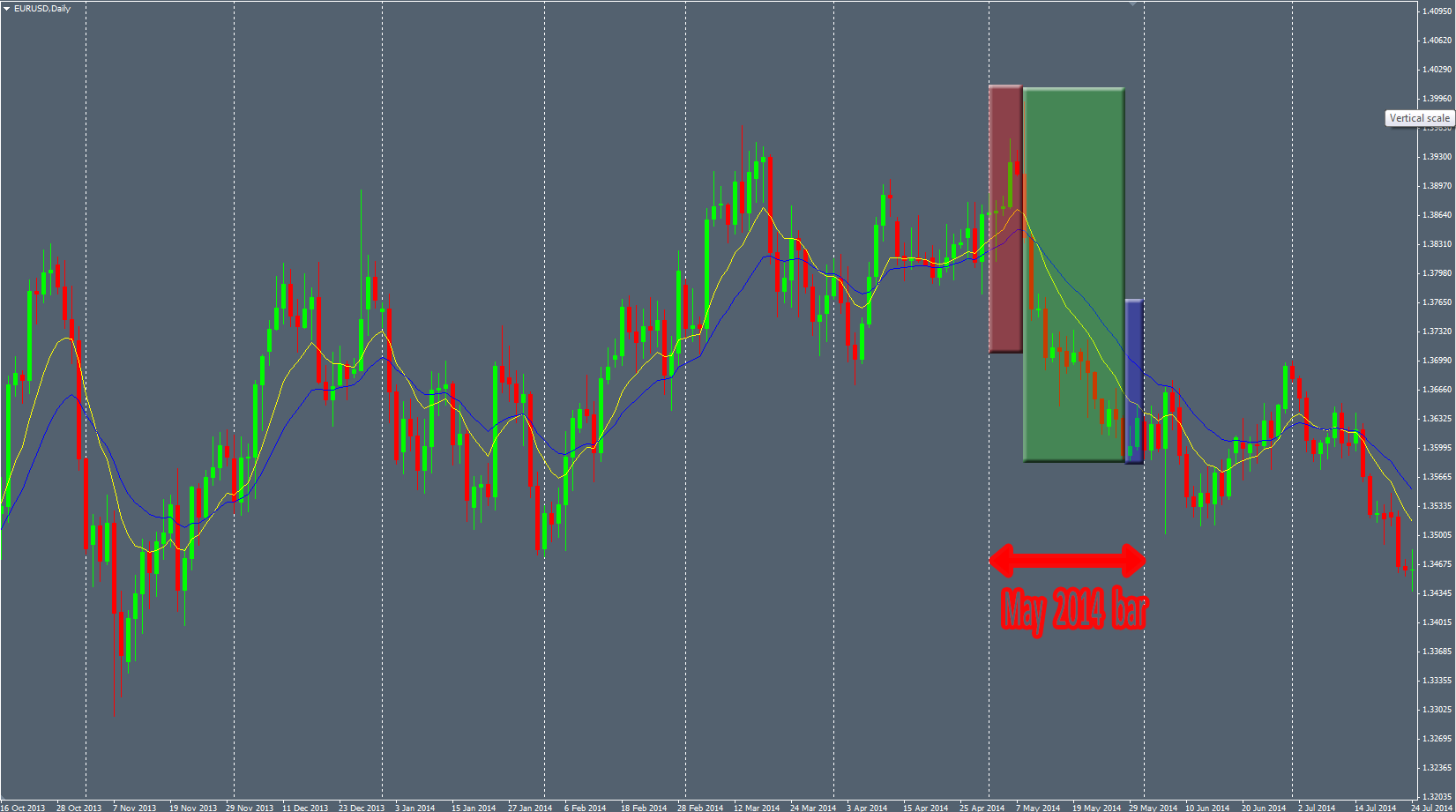
Even more surprising. In this case, we see the respect of a upside Trendline. The Price touches it several times before the breakout. And after the breakout, the Price retest it. Like on the Markets.

random-1

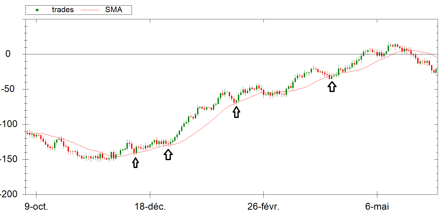
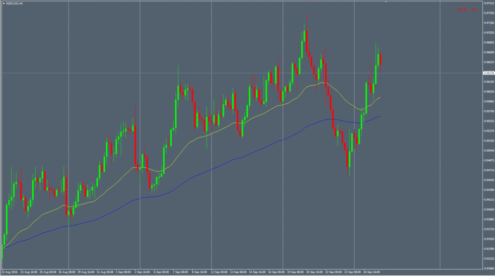
This last example shows the respect of the Price with a Simple Moving Average (period of 200). It can be defined as a “Trend”.

Again, it’s easy to look at the basic algorithm generating these pseudo-random data. There is no trick. Only random numbers glued together. The question is : if you didn’t know that these data is “random”, would you be able to notice it ?

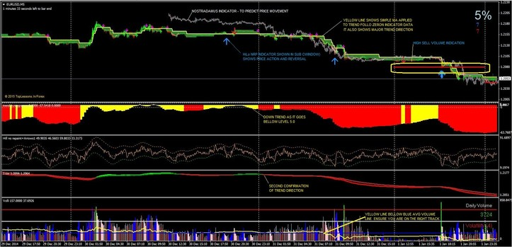
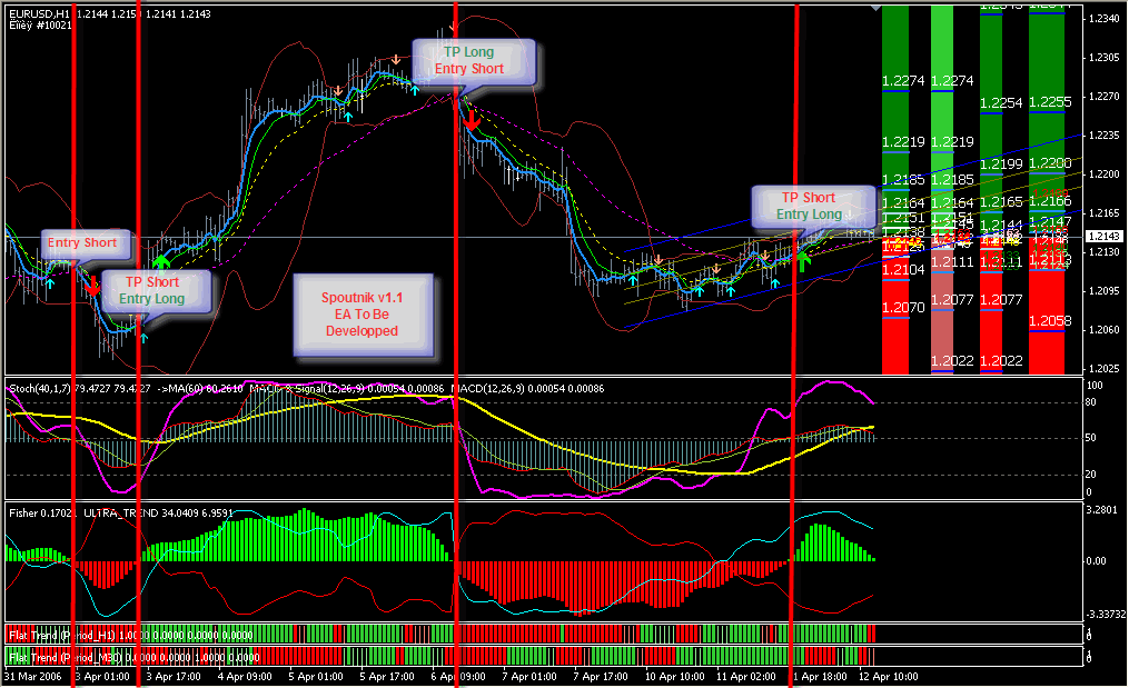
I posted some screenshots chosen randomly. I could have posted more and more of these, showing the Prices following the famous patterns and concepts : Elliott Waves, Double Top/Bottom, Triple tap, Fibonacci retracements, Support/Resistance, Supply/Demand, Oscillator divergence, …

The fact is that these patterns and trading concepts appears regularly in random data. Does that mean that these patterns we seen in the Financial Markets are the product of the randomness ? These patterns really exist or it’s just the result of our expectations in our mind ? Are the Markets random ?

That’s a lot of tough questions without proper answer. But what’s sure is that these trading patterns and concepts emerge within random data. It can be inspiring for a lot of traders who are not afraid to question themselves.


Price structures

Pricestructures

That’s good to see reliable price patterns on the Markets charts when you zoom in but it’s even better when you can deduce the presence of price “structures” when you zoom out. Stepping back from the charts is often efficient and allows you to see the overall picture about the Price context.

Just taking unwisely the Engulfing bar and Pinbar Price patterns everywhere on your charts will help the Markets to suck out your money very quickly from your wallet. When we see this kind of pattern, we have to notice the overall picture of the Price Action to answer this simple question : what is the state of the Market ?

Taking in account the Market context allows the trader to ask himself if the Price is ranging, if it’s trending, if it has awkward behavior, if it has nice and fluent behavior, if it’s likely to pop, to drop, …

With time, experience and backtesting, I categorized some states of the Market I like because it’s offering very good probabilities to make money on it. I call these “structures”. It’s not like a Price pattern, composed by only 1, 2 or 3 candles. It’s more like a larger set of candles giving the overall picture. We have to consider more the Price movements and hotspots to notice these structures. It’s not a systematic criteria and relies much more on the discretional analysis of the trader. No robot is able to see them easily. These structures can be more or less accurate depending on the Price context. The goal is to take the best ones.

“Slide” Structure

The first structure is defined by several criteria :

  • A significant and clean trendline
  • A significant horizontal level
  • The Price breaks this trendline
  • The Price retests this same trendline with a nice price pattern
  • The level has a confluence with significant Fibo ratios (not mandatory but it’s often the case)

Then, when all these criteria has been checked, you can use a nice price pattern, like an Engulfing bar for example, as a catalyst to enter the Market with proper Entry, Stoploss and Takeprofit levels.

The Daily NZDUSD chart printed a perfect textbook “Slide” structure 2 months ago. I was not able to take it because the Price was in a hurry to drop and I was still in a AUDUSD trade. We can see here, the nice and efficient trendline:

NZDUSD-trendline

The significant horizontal levels (the price interacted with this level in the past) :

NZDUSD-horizontal

The Fibo ratios showing the high confluence of this spot :

NZDUSD-level-1

And the lovely Price pattern as a perfect bearish Engulfing bar :

NZDUSD-level-2

This kind of structure delivers very good winratio over the time. But the drawback is that it does not print very often on the charts of course.


“Pinch” Structure

This other structure is pretty interesting and needs more discretional analysis. This a retest of a significant horizontal level in a specific Price context. To identify this kind of horizontal level, you have to analyze before the interaction with the Price on it to see a “Pinch” of the Price.

On the following picture, in line mode to see it clearly, we can see that the Price printed some “hooks” to confirm this level. After that, the Price bounced on it and once it broke, when can wait for a bearish sign and nice Price pattern as usual :

pinch-1

Some random examples to illustrate because it needs a bit of habit to notice them easily :

pinch-2

When the Price broke this horizontal level, we will look for a bearish Price pattern once the Price touches it :

pinch-3

To be more concrete, I took a trade 2 weeks ago on the GBPAUD H4 chart with a lovely Pinbar within a very nice “Pinch” structure. Here is the chart in line mode to see clearly the spots :

pinch-4

And this great bearish Pinbar on the H4 chart offering a very good trade opportunity :

pinch-5


“Triple tap” Structure

A triple tap structure is composed by 3 legs of higher highs (or 3 lower lows in a bullish setup). The reliable “Triple tap” structures are more rare and can be used with a oscillator indicator (like RSI or Macd for example) to notice divergence between the both. Here is an example on the AUDUSD with the divergence :

triple-tap1

triple-tap2


“Consolidation retest” Structure

This one is pretty easy to detect when you see ranging Markets. Every Price moves follow some basic rules as the impulsive move, retracement move and consolidation move. A Price can’t move into one direction without having a rest, time to time. This rest is called consolidation (or ranging Market) when the Price goes in a specific range. In this period of time, you can easily draw “boxes” to frame the Price like we can see below:

retest-1

After that, you have to wait for the Price to break this consolidation “box”. Once the Price broke it above or below, you can seek for retest of the box with a nice price patter. This is what happened with my AUDUSD Daily lovely Engulfing bar last year:

retest-2

The consolidation can be more or less obvious to see. If the consolidation area is not very clean and clear, it’s better to avoid it.

Others structures…

The previous Price contexts are my favorite ones. However, sometimes you can see very good Price Pattern in more standard structures. For example, I took a trade last week on the GBPAUD H4 chart on a significant horizontal level. The Price Pattern was very nice to see and the timing (the middle of the week) was almost perfect :

other

We can see other classical structures, like “Double Top”, “Double Bottoms” or “Head&Shoulders”. Finding a reliable Price Pattern within these efficient Price structures can be rewarding too. Add a salt of timing idea and you can obtain good probabilities on your trade.

To summarize : If you trade the Price Action without taking in account its context, you can have hard times. It’s always important to have an overall picture of the Price by zooming out and stepping back from your charts. This is where the discretional analysis of the trader comes into play.


Scam-o-meter on track record

detector

Trying to become a true profitable trader and building your own trading system is a long and tedious journey. You will have tough periods climbing sloping mountains of doubts and fighting the wild psychological bias hidden in the bushes all along your travel. The obstacles on the path to victory are diversified and one of them can be very odorous : the scam. You will have to avoid to walk on it like dog poops.

Here’s a little article to help the investor and the rookie trader to detect and avoid them. You can use it on the track records  you can see on every trading websites. This is a very simple scoring system where the 0 lets assume that the system is reliable and the 10 tells you to run away from the trading system.

Later, I’ll do an article to use efficiently the scamometer on trading websites.

We will start with a scamo-score of 0 and we will add points progressively trying to detect the best dog poops in the retail trading landscapes.

The drawdowns

When you see a bleeding equity curve, you can ask yourself how the trader is managing the risk… Does he use stoplosses ? Does he hedges ? Does he keep positions opened during long time ? Does he accept the losses ? Does he like unicorns ?

By seeing bleeding equity curve, you can add a +4 to the scamometer. I chose arbitrarily the most popular system on the Myfxbook website. The equity bleeds like an investor cutting his wrists:

mostpopular

The  curve look

When the growth curve is very sexy, appealing and hot, just like a linear curve, you can worry. Indeed, the track record shows in this case that the pseudo “trader” doesn’t accept the losses and is very likely not using stoplosses. This is very typical of the Martingale/Grids systems.

Give yourself a favor and add a nice 6 points to your scamometer when you see this :

linearity

Sorry guys, the progression of a profitable system equity curve is never linear. Over the time, you’ll see this kind of thing (this other system is from the same scam-author than the previous one) :

pipster

The ratios

The CRR (Chance/Risk Ratio) is a simple but efficient ratio calculated by dividing the percentage growth by the drawdowns. Thus, you have a quick estimate of risk and potential of the trading system. You can calculate it on a montly, yearly or historic basis to notice the evolution and the risk mitigation of the trader.

If the CRR is lesser than 1, you have a failing trading system in progress. This is cute to see. You can easily add a +2 to your scamo-score.

If the CRR is above 1, you have some kind of flat expectancy system but you have to confirm it with other metrics. This is quite neutral.

If the CRR is above 2-3, you start to see a decent trading system making money in theory. Again, you have to confirm this with other metrics.

The system vocabulory

When you assess a trading system, you have to read a short description to sum up the trading style of the trader (swing/scalper, fundamental/technical, …). The scamometer can detect some keywords in order to warn the investor against the shittiest systems. Here a sample of the interesting keywords :

  • Martingale : This keyword is pretty magic. If you want to assess a system based on Martingale, you can directly put your scamoscore to 10 and forget all other criteria. You found the bullshit holy grail. If you are bored, watch the system over the time, let it  explode, this is always funny and some kind of relaxing to see. This is less funny for the investors/traders.
  • Grid : The grid is the cousin of the Martingale. Different phylosophy, same result. It’s designed to fail but it’s a bit more vicious. The Martingale has often a low life expectancy but the Grid can live longer before blowing up your account. But it will. The risk exposure of this kind of system can be huge and the risk control is almost always none.
  • Full automated trading system : This one means that there is only a dumb robot taking trades on the Markets. This robot is so smart that he knows better than a human how the Markets behave. Is it possible that a simple EA trade efficiently the Markets over the long run ? The markets are so easy to corner ? Hundreds lines of code can beat the other market actors ? Even if the deep learning concepts could improve the Markets insight in the IT field, you can safely add a +4 when you see a 100% automated trading system. If the trader uses a “mix” of manual and automated trading, the scamometer could significantly decrease its BS detection process depending on the trader style.
  • Custom/Proprietary indicator : This is a trading system using a very top secret confidential indicator created by the trader. He was lucky (or smart ?) enough to find the Holy Grail. This is only owned by the creator and he doesn’t want to share its secrets because, you know, if he does, he will lose its hedge on the Markets… Of course trading holy grails don’t exist… No custom/proprietary indicator can corner the Markets. And you can ask yourself what would happen if one day a trader discover the Holy grail ? How will the Markets behave ? Even if you can create nice custom indicators, it will always be derivated from the unique raw information : the Price Action. Save time : use the raw information instead of derivated ones.

Using the prefix “pseudo” before the 2 first keywords doesn’t change the score calculation.

But sometimes, the lack of certain keywords can increase drastically the scamoscore. For example, if you don’t find any information about stoplosses and you know that it’s some kind of UFO concept for the trader, you can add a nice +9 to the overall score. This remark can be moderated by the fact that instead of using stoplosses, true profitable traders can use hedging. However this is very specific, hard, and complex skills to master. The number of true profitable traders using successfully the hedging instead of the stoploss is equal to the number of finger on a hand of an armless person.

The trader beliefs

This is very important to identify how the trader sees the Markets and the risks associated. Its behavior and words are important too. You’ll find some “traders” being arrogant, proud and pretentious. All the true profitable traders I know have a common quality : they are humble. And on the Forex you have to be humble. You have to respect the Markets. Once you ended your journey by trading a profitable system, you become necessarily humble because of all the dusts you bit before achieving your goal.

Here’s a funny story of a scam-trader offering its signal service on some signal forum community few months ago. You can see the bunch of common and basic psychological bias he had and its amateurism :

BS-1

I don’t even talk about the huge and so risky performance he had. You can see the wizard explaining that he has a “gift” being able to know where the Markets will move :

BS-2

He self claimed being the the “Goldman Sachs” of retail market. Such a gem. This one comes back regularly on the rookie traders forums. A lot of people want to trade for JPMorgan or Goldman Sachs banks. It looks like this is the edge of the trader carreer. But you can trust me, when you are a successful profitable and independant trader, you certainly don’t want to trade for these intitutions.

When some non expecting events occured, the “trader” finds excuses (very common psychological bias when you start trading is to not undertake your own responsabilities) :

BS-4

How this has ended ? With a lovely margin-call of course:

BS-3

End of story. End of trader/investors money.

The winratio

This rule is very easy to understand. If you find a system with a overall winratio higher than 90%, you can add +6 to your scamoscore.

Otherwise, it depends on the trading style of the system and especially the expectancy of the system. Considering a winratio without taking in account the R:R doesn’t make any sense.

The lifespan

Again, it’s a very simple and obvious rule to follow :

  • Less than 3 months of track record, you can add 5 points to your scamometer.
  • Less than 6 months of track record, you can add 4 points to your scamometer.
  • Then, you can decrease by 1 point every 3 additional months.

The backtest results are not considered by the scamometer. Backtest and demo trading are nothing compared to the real live trading.

Abracadabra !

By applying these weird and empirical calculation rules, you’ll have to say “Good bye” to your money in the future if the overall scamoscore is above 10.

Abracadabra… And it’s gone !


Insight

header

Since I remembered that I had a website, I wanted to share an indicator with my single and unique visitor in order to thank him to place great hopes on me to publish a new article browsing this ugly and empty website every single day… That’s so touching… Thanks my dear little Google bot !

In fact, that’s pretty strange because I’m supposed to be a “Naked trader”. “Naked” because I trade without any indicators (not because I trade in brief). So using an indicator on my charts is not expected. However, this indicator is not an oscillator derivated from the Price Action, it’s the Price Action itself shifted in the time. Dear little Google bot, if you read my previous article about the timing, you know that I like to play with the time in order to multiply the opportunities on my charts and find more reliable setups.

It’s a pretty dumb indicator because it’s just drawing Price Action by shifting the time period. However, it can be useful if you want to see the Price Action differently, from different perspectives. Instead of looking for only one pattern at a given time on a given location, you can see the price reacting in a more accurate way than usual.

I had this idea when I was standing on my toilet to hang a clock, then I bumped my head and the flux… No… I’m wrong… I had this dumb idea when I was using different MT4 candles closing time in order to have more setups with only 1 pair. I used the standard NY closing time and the midnight EST closing time. So I decided to do it automatically with an indicator by shifting the time in real-time on my charts.

I’m convinced that the time is an underated component for a lot of trader. We are a lot to look at the levels with attention, to analyze the movement of the Price relating to its value (the Y-axis) but I think the X-axis, the date, the hour, the time is as important as the Price value.

Some traders can argue that the closing time is very important because every traders use the NY closing time and that’s why it’s the only relevant closing time. However, as pure technical traders we can’t forget the first and main principle of the technical analysis :

Everything is in the charts.

The Price is the same everywhere on the charts, no matter the candle closing time. Period.

To be more concrete, here’s an example with a SELL H4-based trade on the NZDCAD I took several weeks ago. I was paying attention to this level because the NZDCAD was almost at its historical higher rate. I was looking for selling it in this area. However, no reliable pattern printed on my standard NY closing time chart :

NZDCAD-1

I was so sad… I was depressed to see nothing on this lovely level. I took few antidepressants and had the idea to use the weird indicator I wrote… And the pattern appeared as if by magic :

NZDCAD-2

Here is the same chart in motion and twerking thanks to this indicator:

nzdcad

This indicator allows to shift the time on H4 and D1 timeframe. The indicator shifts the time based on the H1 timeframe so the H4 charts will refresh 4 times to show 4 shifts. The D1 timeframe will refresh 24 times to show 24 shifts.

Here’s another example on the EURCAD H4 chart :

eurcad

You can define your personal refresh rate if you want by customizing the H4 or D1 delay in milliseconds. In a default configuration, the indicator refreshs H4 every second (1000 millisecondes) and the D1 every 400 milliseconds (because there are 24 refresh…).

To use it, you need to put your current chart in “line chart” mode. After that you click right on your chart and you select “properties”. Then, in the “colors” tab, you select the “none” color for the “line charts” box.
Finally, you drag&drop the “Dynamic_Price_Action” indicator. You can customize the color of your candle as you want (the default settings are my default chart colors). Only H4 and D1 timeframes are supported.

You can download this “indicator” here (bugs included for free) : http://s000.tinyupload.com/?file_id=60117540697081890715

If this indicator doesn’t work for you, if you find it useless, if you think this post is useless or even this whole website, feel free to insult me by email. I’ll read this carefully as I have plenty of time.


Stop your loss

header

When I started this blog I never imagined that I could ever write an article on the necessity to use stoploss in Forex trading. However, browsing the retail forex world is so astonishing when you see plenty of traders taking orders without stoploss. When I started to address the Forex Market and was still naive, I thought that the vast majority of traders couldn’t think one second about entering the Markets without stoploss. I thought only few of them were cowboys telling themselves the stoploss is just an inconvenience for their ego. I was wrong. It is the contrary. More retail traders are not using stoploss than using it.
I’m often amused when I look at the “signal providers” or “professional traders” equity/growth charts when they don’t use stoploss, their equity curve can be very typical. For these kind of traders, claiming themselves “pro” and wise “risk” manager, I will be happy to be the counter-part taking their money when they will margin call. Forex is not Poker.

The stoploss is an automatic order that will be triggered when the price will reach it.  It’s the opposite of the TP (Take Profit) order, its alter ego.  The stoploss is created in order to protect your money, to manage your risk. But you have no obligation to use it, you can take a position without any stoploss. It can be seen as an annoying thing preventing your trade to reach its target. Because if the price reaches your stoploss before reaching your target, you lose money ! Shit ! I don’t want to lose money ! I’m here to make money,.. the stoploss is bullshit !

You can have this standpoint when you’re not able to see further than the tip of your nose. Because, in the hard real Forex world, you can’t earn money consistently without losing a bit of money sometimes. It’s like that and it’s perfectly normal if you think about it 2 seconds. It cannot be different. But we have to ask ourself why the stoploss is not an option to earn money on the Markets over the long run ?

Why using stoplosses on the Market o_O’ ?

Because ! …thanks for reading this article…


There are few reasons why the stoploss is so important on the Market and we will see that it’s way more than a simple contrary order to your position.

1°) The Stoploss defines the frame of your trading system

It’s important to understand that every trading system is technically nothing more than a basic probabilistic system. Technically of course. Because, in practice, successful trading is just about solving your psychologicals bias. So, technically your trading system can be seen as a probabilistic system with standard parameters.

Your trading strategy is defined by a set of rules which you follow (or not) and it creates a trade history. You will have winning trades and losing trades. You can say you are profitable when there is more money on your account before you started to trade during the period you analyze. Depending on your trading style, you can have a lot of trades per month, a lot of winners or a lot of losers. But what’s universal here is that you will have winners AND losers. You can’t avoid losing trades, that’s impossible.

Now the question is : what is the definition of a winning trade and a losing trade ?

We could simply argue that a winning trade is a position where you make money and a losing trade is a position where you lose money. The problem with this kind of definition is that your losing and winning concepts will vary and change over the time. It’s too generic. If you think about it, a trade that went well and was in profit during some time can reverse and become a loser. When will you decide then it will be a winner or a loser ? It will depend on you, when you take the decision to cut the trade. For one single trade, depending on your mood, your behavior, your psychology, the same trade can be a winner or a loser. It’s a problem. Be sure that the human psychology is a very changing thing. How can you assess the profitability of a system if you change the winning and losing concepts all the time ? How can you calculate the expectancy of a system by changing the winning and losing rules all the time ? Can you know if you earn money on the Market if you don’t know if it’s a losing position ?

To become successful, we have to avoid relying on changing and varying things like us. We have to set the rules and the system has to be as steady as possible to evaluate the risks properly. Here comes the stoploss.

The stoploss will help you to set the losing trade concept without changing the rules. By setting your stoploss on every trade, you know exactly when your trade is a loser one : when the stoploss is hit. From there, you will be able to assess the expectancy and the profitability of a trading system because you defined the “loss” concept relating to the “win” concept. Otherwise, good luck :-)

2°) The Stoploss is designed to manage your risk

As described before, trading is a probabilistic game. When you take a position on the Markets, you bet on the future value of an asset. It’s pure speculation. Your trading style and system will dictate you how many trades you can take every month and for every trade you have to calculate the risk implied. You cannot avoid it. Even if you don’t want to do it, the lotsize of your position will do it for you. As said before, you know as a wise trader that you will have systematically losing trades in your track record.

If don’t use stoplosses when you take a trade, you cannot know how many you will lose. This is financial Markets world. It’s not about dealing sweets during recreation. When you enter the Market you NEVER know what will happen. You have to expect always the worst-case scenario. What if you take a position without stoploss and the Market will go instantaneously against you ? When will you cut the trade to accept your loss ? Will you accept the loss ?

Entering the market without stoploss is like “all-in” in Poker. You risk all your capital on a single one position. It’s good if you win but it’s pretty ugly if you lose. Like the Poker, it’s all about probabilities. You can make a good move if you are lucky but it’s impossible to think about making money over the long run with this kind of standpoint. You can earn a lot of money in the short-term but one day, you will lose all your money. It’s useless to earn a lot of money to lose it all few days after. Being a wise risk manager, as every trader is, and risking all your money and the money of your clients on one single position doesn’t make sense at all.

Using a stoploss on every trade allows you to expect the worst and manage the risk on the Markets. Then, you can calculate the risk you want to take on each trade in case the price will reach your stoploss before your take profit.

A lot of so-called “pro” traders charts are screaming the use of the “Russian roulette” trading style by not using stoploss on every trade. It’s pretty distinctive. I chose some myfxbook charts almost randomly :

example-1

example-2

example-3

We can never have the proof that these guys don’t use stoplosses just by staring at their chart but the “tobbogan” is really typical of this kind of system. These systems have often really high winratio, as seen in the last example. It can be explained easily by understanding that these dangerous systems are likely to not use stoplosses and letting the position run until the Price go in favor of the “trader”. That’s why the winratio is so high. However, sometimes the Market do some erratic movements and go against the position. The “worst-case scenario”. One day, the trader has the obligation to close the position if he doesn’t want to margin call. So it’s a huge lost  of the entire capital in 1 or 2 trades.  You could argue that overall these systems made money. You are right. But as usual, what if you used this system to trade your money just before the drawdown ?  What if you see your capital going down for 60% ? You would have left and probably you would have lost a lot of money. And I don’t talk about the equity curves this time. The margin call is a matter of time.

Another typical “I don’t know what is a SL” trading style chart is the “floating” open positions. You can see that the equity curve and the growth curve hate each other :

example-4

It’s due to the same root problem : the trader doesn’t accept to lose money. He thinks the Market is wrong and its trading is right. He is convinced that the Market will reverse soon so he lets its current positions floating without using stoplosses. Until one day :

example-5

Always expect the worst when you enter the Market. Use stoploss to protect your capital.

I already talked with people telling me that stoplosses are useful but we have no guarantee that our broker will honor them in very volatile conditions. It can be true. During the SNB earthquake in January, some brokers were not able to execute all the stoplosses. But it’s another issue relating to the Market structure and the broker itself with its liquidity providers. I doesn’t dispense you to set a stoploss for each trade you take.

Moreover, as a swing trader, you have to know that your stoploss orders are more likely to be honored (in comparison to the intraday traders using minors S/R levels) because your stoploss is really likely to be in big order clusters which improve the probability for them to be triggered, even during this kind of extreme volatility periods. For information, you can see here that the location of the big order clusters are often where we put our stoploss :

oanda


3°) The Stoploss symbolizes your loss acceptance

The last but not the least. Don’t forget that the psychological aspect is the main issue to become a profitable trader over the long run. In the early stages of your trading journey, you’ll have to accept the Market is always right and you will be wrong sometimes. It’s not  necessarily because you did mistakes but because you have to lose a bit of money to earn more money. The stoploss is here to tell you that in case the price triggered it you lost money but you protected your capital. It’s a loss. You have to deal with it. Accept the loss to earn money over the long run.

Moving a Stoploss during a live trade highlights your difficulty to deal with the losses, when you widen it. Moving a stoploss is like not using a stoploss. You increase the initial risk of your trade, which is a statistical error. Never move your stoploss once it’s set. Except to put it on break-even.

To conclude, here is an interesting podcast of Walter Peters. I advise you to listen these 2 true pro-traders speaking about stoploss : http://www.2traderspodcast.com/podcast/ep04-what-goes-into-setting-your-stop-loss

Another interesting quote from Rolf of Tradeciety :


The Beauty of the Pip

header

The fact that the vast majority of traders and investors on the Forex Market are losing money is well known. The so-called statistics claim that more than 95% of the traders lose money. It can seem really huge but when you are a true profitable trader, it’s always surprising to see the incredible amount of scams and bullshit on the web. The ratio could be the same : 95% of shit and 5% of useful information. Nothing is done to help the wannabe traders in a efficient way. I’ll try to give some tips for the investors to identify the wrong and dangerous trading systems in a series of articles.

To assess properly a trading system it’s important to understand the information displayed on your screen, like Myfxbook statistics for example. There is a lot to say about it. However, I’d like to write about a simple and easy way to know if a signal provider, trader, system is not transparent with its performance.

I’m still surprised to see all these so-called professional traders and magical trading systems printing their performance in PIPS. Honestly, it doesn’t make sense.

It’s important to understand that the quantity of PIPS swallowed during the month is not important at all. The percentage growth is.

Why ? Because the quantity of pips doesn’t represent the quantity of money you can earn. The Pip is the basic value of the Market and has to be converted to make sense in term of money. It’s crucial to understand that even if you earn a lot of pips per day, it doesn’t mean you earn a lot money. As I already explained on this website, if you want to manage properly your risks on the Market, you have to trade with constant risk : you risk always the same amount of capital per trade (subliminal reminder message : you never know if a trade will be a winner or a loser one, so treat each trade with the same risk).

By using constant risk approach, you don’t care about the amount of pips. The amount of pips highly depends of the trading style and timeframe used in a system. To be more concrete, here are examples of trades I took with big difference in the amount of Pips.

First, the GBPCHF Weekly trade I took during March 2015 :

GBPCHF

Earned Pips : 454 pips

Second, the AUDJPY H4 trade I took few weeks ago :

AUDJPY

Earned Pips : 75 pips

In the first case, I won 454 pips on the GBPCHF trade and in the second case, I won only 75 pips on the AUDJPY trade. Did I earn more money from the GBPCHF trade with more pips involved ? Absolutely not. I earned the exact same amount of money : 2%. That’s all.

Why the amount of pips doesn’t make any difference ? Because my lot size was different. It was calculated to risk only 2% on each trade. Since the first trade is a Weekly one, the stoploss was wider than the one on the AUDJPY trade, which was based on the H4 timeframe.

It was an example. Now think about it : when a pro-trader tell you he is able to make hundreds of pips every week, does it make sense ? In fact, no. He could earn plenty of pips every day and make only tiny percentage growth depending on the risk he takes on the Market. And don’t forget the amount of pips doesn’t give the risk approach of the traders.

To show you where lies the problem for the retail investors, I gone to the signal providers list on the famous Myfxbook website and I took the top 3 signal providers :

signal-providersI browsed the website of these 3 signals providers. For each, I displayed the “results/performance” menu used to prove to the customers that the signal is efficient and makes money.

First one : Pipsar

pipsar

Second one : Forexsignum

forex-signum

Third one : App-Forex-Signals

app-forex-signals

Funny, isn’t it ? Nobody talks about percentage growth, only the amount of pips. You can even see the graphs from Myfxbook displaying the quantity of pips per month but not the native Myfxbook graph with the percentage growth…

With these data, you can’t know if the performances are good for each signal provider. Don’t get me wrong : I don’t say they not making money. I only say : they are not transparent on their performance because displaying the amount of pips has no sense. 

And don’t forget that their drawdowns are not even visible (except forexsignum)…

My advice : Be careful when you see this kind of website. I chose them almost randomly as examples. The performance data, expressed as Pips, doesn’t show anything. It’s not a good criteria to choose a reliable trading system. The percentage growth is appropriate in conjunction with other data (expectancy, profit factor, historical drawdowns, average R:R, …).


Timing is everything

header

One of the most common psychological bias in trading is to think that to figure out a complex problem, you have to use complex tools. It explains why the mainstream and loser traders are mainly using such weird indicators like RSI, MACD, Bollinger Bands, … Displaying complexity on your screen with a lot of indicators can be comforting by having the feeling to have an edge on the complex Market with complex trading system. Thus, you can think you understood something that nobody else did. Some secret formula by blending different technical components.

This psychological bias can lead to such beautiful and charming screens gallery like this :

TradingScreen img_5503f27355d0d forex-indicators

Better to see that in a museum… You can have a lot of fun and artistic ideas by browsing the forums of the famous Forexfactory website. Often, the logos of the trading systems are as beautiful as the graphical indicators. To be honest, there are others psychological bias involved here. But it’s another topic.

No suspence here : the indicators are laggy and almost useless.

Raw informations of the Market

Instead of seeking the information into complex and ugly indicators, we can start by asking these questions : what is the raw data printed on your charts ? What is the source of everything when you look at your chart ?

And we can use the same point of view as usual : if the mainstream traders are doing something, let’s do the contrary. We will print nothing (not even the price data) on our trading screen :

blur

Why displaying this stupid screen ? Because, we can see the 2 most important informations of the Forex : the Price Action value on the Y-axis and the Time on the X-axis. The same with the Price Action candlestick :

noblur

Now you can do yourself a favor : hit the Ctrl+Y under Metatrader to print the timelines.

timing

Yes, it can sound really dumb, I know. But you’ll see that the printing of these tiny dotted lines can help you a lot to improve the winratio of your trading system… In order to discern the entire specific timing problem, we have to move on another topic.

One of the most interesting statistic in the Forex world

I will not speak about the shitty statistic about the 95% loser traders or another unverifiable stupid statistic. I will explain that you can check by yourself this little but really interesting statistic :

Between 98% and 100% of the candlestick printed on your charts have an open price different to the lowest price for a bullish bar and an open price different to the highest price for a bearish bar.

What does that mean ? It means that the vast majority of the time, the first price move on the Market is the wrong one…

Here is my stupid MT4 Expert Advisor displaying statistical data about the opening and lowest/highest price. You can run it on every pair you want and notice that information : around 99% of the bars on your charts have an open price different to the highest/lowest one. To be more concrete : if you see a bullish bar forming with an open price equal to the lowest period price, you can expect that the price will reverse.

I could write a lot of things about this but we will sum up in order to reuse this information easily. Generally speaking, the very first movements of the candlestick are the wicks, as the last ones. The core body of the candlestick is very often created and generated in the middle of the period time candlestick formation.

Let’s take an example with the EURUSD, last year during May 2014 :

EURUSD-M1-may

It’s the monthly chart of the EURUSD. You can see that this bar was important for 2014 as the price have tanked since this moment. Now, we can “zoom” in by looking at the Daily timeframe :

EURUSD-D1-may

Here is one of your best Forex friend : the previous tiny dotted lines. It’s really interesting to see the price movement inside May bar. We can split this monthly bar in 3 main parts :

EURUSD-D1-May-color

  •  The red area : the price goes up in the very first day of the month
  • The green area : this is the core of the month, all strong price movement is here : SELL
  • The blue area : the price retraces a bit before the month closes

The red period of time shows you that the first movement of the month is not the main one. As a profitable trader using high probability setup, we prefer to catch the main movement of the price : the center of the monthly bar. In order to improve our timing entry on the Market, we can think about taking only the very best setup by entering the market only during these green periods of time : the core of the bar.

Use the time to improve your winratio

The funny fact is that you can use the previous informations on all timeframe because of the fractal nature of the financial Markets. If you like high-probability setups, you can even use it on M30/H1 timeframes. I imagine you know as a trader that it’s better to trade intraday during the London and New-York session as the volatility is more important. This is the same principle : the beginning of the day, the price goes really often in the “wrong” way. It’s called the asian session. The main activity, the core of the day is during the London session and London/New-York session overlap. And the end of the daily bar, it’s the end of New-York session, often against the previous price action activity.

To demonstrate this I choose the current Daily EURUSD candle formation of today (writing article date : July 9th 2015) :

EURUSD-H1

 Sounds familiar ? Here comes the colors…

EURUSD-H1-color

 So maaaaaaagic !

  •  The red area : the Asian session
  • The green area : the London session and New-York start session
  • The blue area : the end of the New-York session

Of course, it’s not an absolute rule or law. The Market will not behave like that every day. But it does it really often and knowing that will provide you an edge.

Depending on your trading style, you can adapt these informations on the timeframe you prefer. Personally, I like the Daily and 4 hours timeframes. Here is how I use this information in my trading process.

Concerning the Daily timeframes setups : I never trade (or very exceptionally) the Monday and the Friday. Why ? Because it’s during the red and the blue period of time. It’s often retracement period of times with a lot of wrong signals. The Monday and the Friday are very often wicks of the Weekly candles. Here is an example with a previous GBPUSD trade I took during  February :

GBPUSD

The main movement of the week is done the Thursday. You can see the strength of this reaction the next weeks…

You could argue that I’m missing some trade opportunities by avoiding trading 2 days per week. You are right. But if you backtest heavily, you will realize that it’s more profitable to avoid some loser opportunities these special days than taking all opportunities of the week, including the winners and the losers.

The last example is on the 4 hour charts. This is the trade I took last week, it was an easy & quick trade :

AUDJPY-H4

This was a perfect timed setup for me because this H4 engulfing bar printed in the middle of the week, the Wednesday. You can see where is the price now… By trading only the Tuesday, Wednesday and Thursday on my H4 charts, I drastically improve the winratio of my trading system.

To summarize : if you want to take high-probability setup, use the time. It’s as important as the price itself. And avoid the very beginning and the very end of each period of time you are trading.


Bloody equity

header

Sometimes I ride the Internet over the funny, creepy, tiny Forex retail world. It’s often hilarious when we, true profitable traders,  see some trading systems with huge profit (+2000% per year) and huge drawdowns (-70%). This is the kind of system we see the most on the specialized Forex website and the most “followed” too. A lot of investors only see the final return per year and don’t even take care of the drawdown. Until this kind of “investors” lose money. Losing money is always a rich experience teaching you the good way to take. This kind of system can be detected really easily except for dumb investors and traders.

But there is one thing the rookie “investor” can have trouble to notice until he will learn what is it exactly : the equity curve of trading system.

Yes. There is another curve different from the growing account curve. I know, it’s surprising. In fact, this curve is as important as the return curve because it explains how the trader is managing the risk over the long run.

This equity curve is calculated by the money available on a trading account at a given moment. The growth curve is easy to understand : this is the amount of money on your account. More you have, more you are rich. However, it’s not because you have $1000000 on your trading account that you can withdraw $1000000. If you have trades running on the Market, you freeze the dedicated money relating to your leverage and lot size. For example, if you have 2 trades running with 5% risk for each (which is crazy risk), you have “only” $900000 available on your account until your trades are closed. 2 x 5% risk = 10% risk. 10% of $1000000 = $100000. Money available : $1000000-$100000 = $900000. In fact, it’s even less than that because of your margin level.

So, the equity curve represents the money commited on the Forex market at a given moment. By analyzing it for a particular trading system, you can see how many money is at risk during accurate periods of time. Of course, if the equity curve reaches the deadly 0 level, you have lost all your money.

The things become funny when the growth curve and the equity curve are no more friends and take their own path to live their own life. It’s not a good idea at all. I took a random example on the famous Myfxbook website :

equity-1

Something wrong ? The same with color painting :

equity-2

Above, you can see that currently the growth is at 92% and the equity around 56%. What does that mean ? In fact, the “trader” is currently exposing 36% (92-56) on the Market. If you only look at the growth and the historic drawdown (26%), you can think that the system could be good to use. However, what do you think about a money management which exposes 36% (more than a third of your account!) of your money at a given time and even since 6 months. Of course, it’s a creepy system and we will see when the equity curve will reach the funny 0 level for a nice margin call.

In this particular case, we can have 2 main hypothesis:

  • This guy doesn’t use stoploss and has a running position since few months. If it’s the case, the margin call is a matter of time. Not using stoploss on Forex Market is like throwing your money down the drain.
  • This “trader” uses stoploss but have a bunch of running positions with too heavy risk implied. Having 36% of its own capital at risk since few months is dangerous. Even, just for one single day, it’s crazy. Imagine taking only 3 trades exposing each one 30% of your account. Surprise, these are all wrong. Account blew up.

When you assess a trading system, don’t forget to look at the equity curve. It’s critical because it provides you the way the trader manages the risk on the market. Now, if you go to some signal provider sites you can have a lot of fun. The famous site Myfxbook launched a signal provider platform few weeks ago, called “signalstart.com”. We can see this kind of system on it :

ss-1

“Alien waves” is aptly named. It’s obvious that the money management is some kind of alien for this “trader”. How it’s possible to expose 80% of its own capital at a given moment. It’s pure crazyness. The proper picture may be that :

ss-2

This system is really lucky because it came really near to the margin call with a cute 81% drawdown and after the equity became higher than the current account. I don’t know why but I bet that this alien has a really short life expectancy. Time will say.

Another funny system called “Strategy that works” :

ss3

93% Drawdown ? Okay… why not. But in that case, what can we call a Strategy that doesn’t work ?

All of these examples are caricatural (but sadly true) because if you let a child trade, the results would be almost the same. Now, we could analyze the risk management of this kind of system :

ss4

In this case, the risk is harder to reveal but still there… We can see the May 26, the trader exposed almost 20% of its capital in one day. It’s huge. Hopefully, the equity curve rejoined the growth curve to make a kiss but the scenario could have been different. You can expect big coming drawdowns with this kind of system.

On the Forex, you have to always expect the worst. Just remind the January 15th…

When you analyze the reliability of a trading system, don’t forget to look closely at the equity curve !

Some trading websites don’t even display this information or partially, like www.share4you.com or www.mql5.com. If you go to these kind of sites and want to invest in some strategies, my advice : Take to your heels.

The equity curve and the growth curve have to be friend forever. They have to follow each other over the long run. If the equity curve falls apart and the growth curve keeps increasing, it’s a really bad sign for your money.