Category Archives: Trading reinforcement


Price structures

Pricestructures

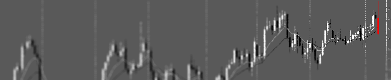
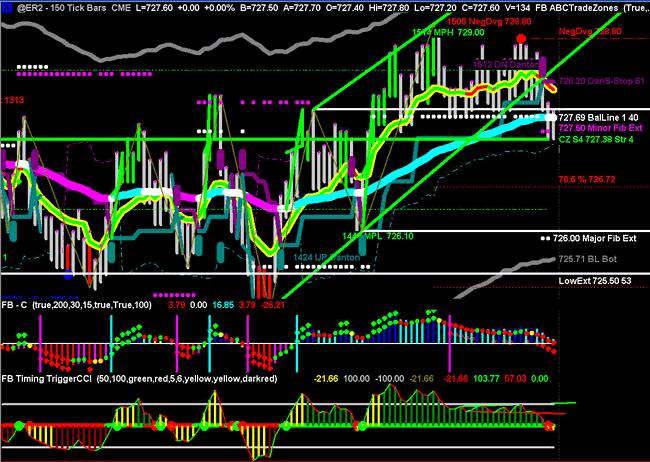
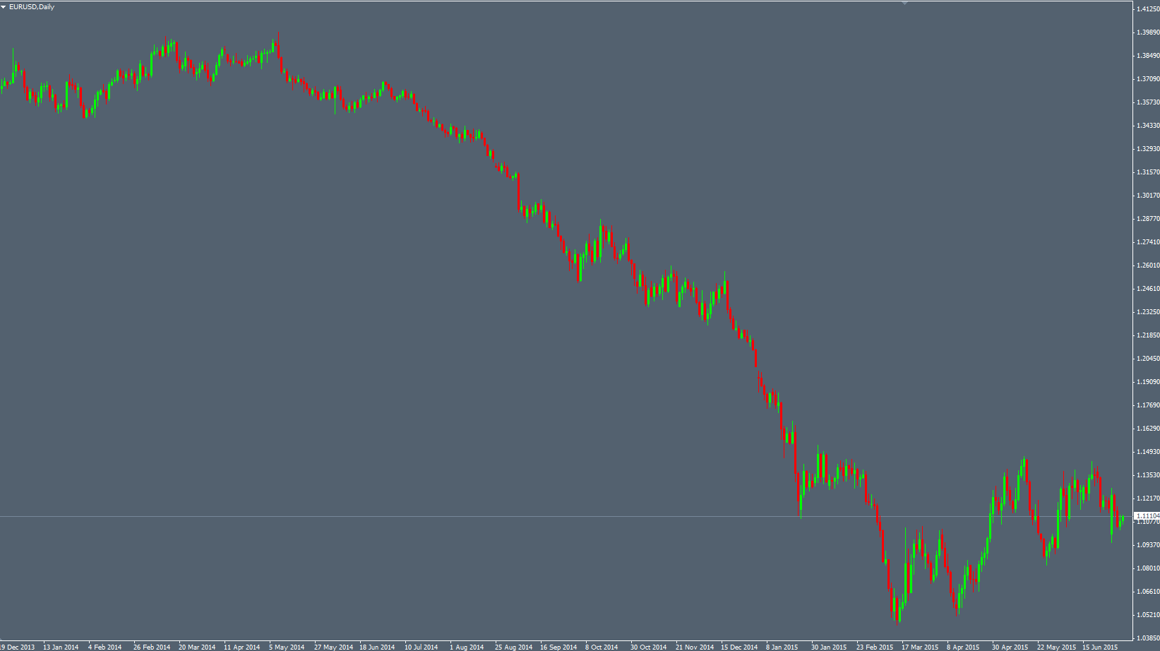
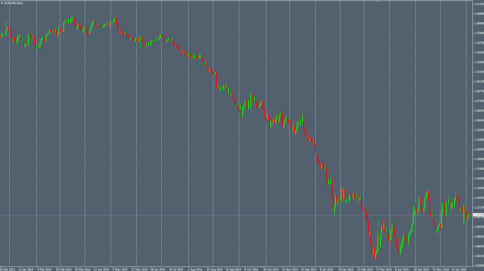
That’s good to see reliable price patterns on the Markets charts when you zoom in but it’s even better when you can deduce the presence of price “structures” when you zoom out. Stepping back from the charts is often efficient and allows you to see the overall picture about the Price context.

Just taking unwisely the Engulfing bar and Pinbar Price patterns everywhere on your charts will help the Markets to suck out your money very quickly from your wallet. When we see this kind of pattern, we have to notice the overall picture of the Price Action to answer this simple question : what is the state of the Market ?

Taking in account the Market context allows the trader to ask himself if the Price is ranging, if it’s trending, if it has awkward behavior, if it has nice and fluent behavior, if it’s likely to pop, to drop, …

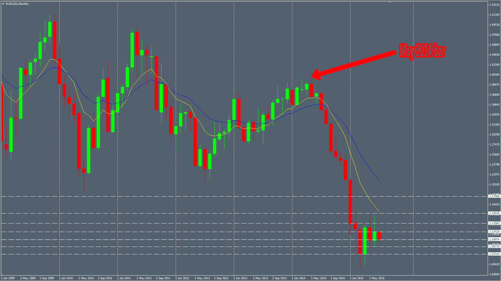
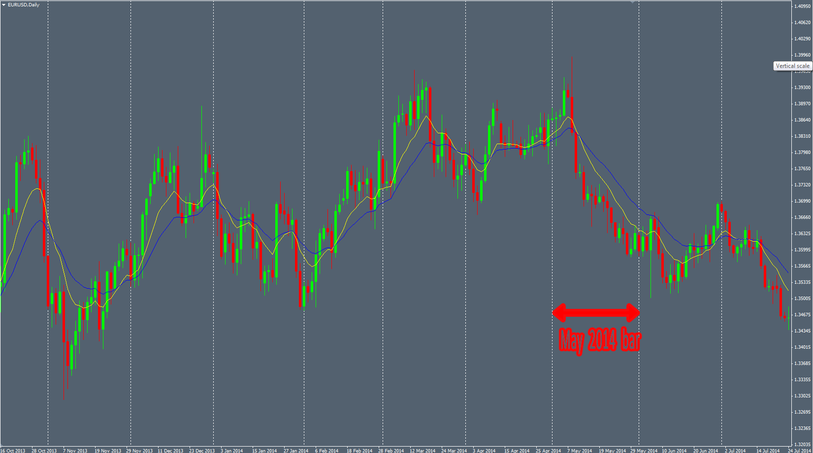
With time, experience and backtesting, I categorized some states of the Market I like because it’s offering very good probabilities to make money on it. I call these “structures”. It’s not like a Price pattern, composed by only 1, 2 or 3 candles. It’s more like a larger set of candles giving the overall picture. We have to consider more the Price movements and hotspots to notice these structures. It’s not a systematic criteria and relies much more on the discretional analysis of the trader. No robot is able to see them easily. These structures can be more or less accurate depending on the Price context. The goal is to take the best ones.

“Slide” Structure

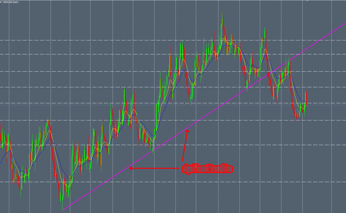
The first structure is defined by several criteria :

  • A significant and clean trendline
  • A significant horizontal level
  • The Price breaks this trendline
  • The Price retests this same trendline with a nice price pattern
  • The level has a confluence with significant Fibo ratios (not mandatory but it’s often the case)

Then, when all these criteria has been checked, you can use a nice price pattern, like an Engulfing bar for example, as a catalyst to enter the Market with proper Entry, Stoploss and Takeprofit levels.

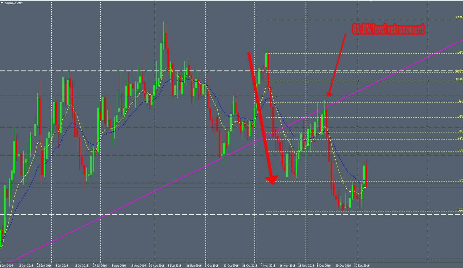
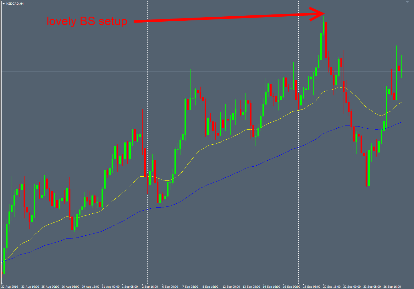
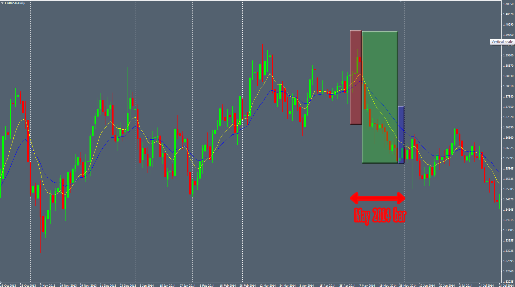
The Daily NZDUSD chart printed a perfect textbook “Slide” structure 2 months ago. I was not able to take it because the Price was in a hurry to drop and I was still in a AUDUSD trade. We can see here, the nice and efficient trendline:

NZDUSD-trendline

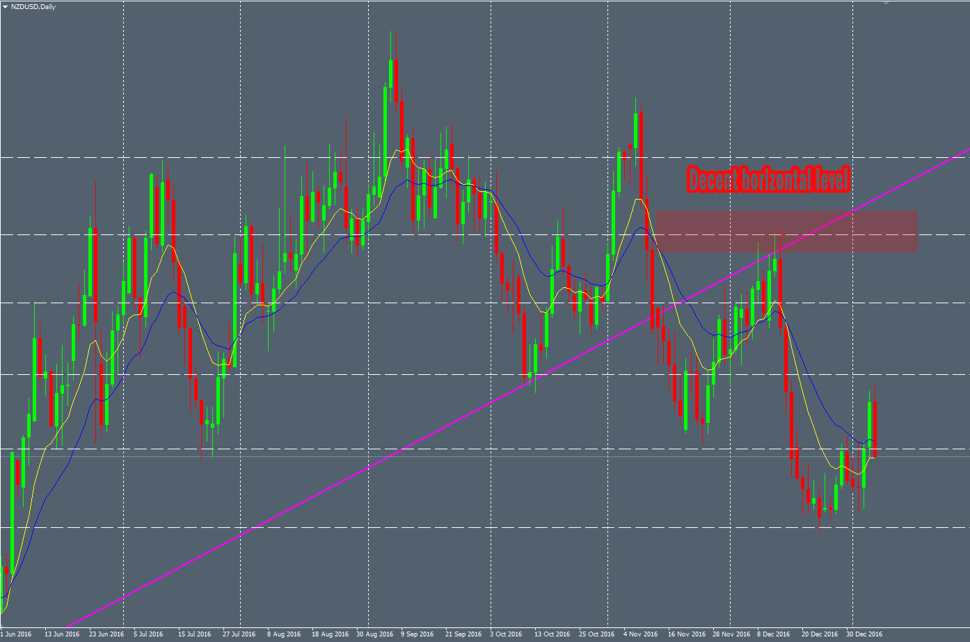
The significant horizontal levels (the price interacted with this level in the past) :

NZDUSD-horizontal

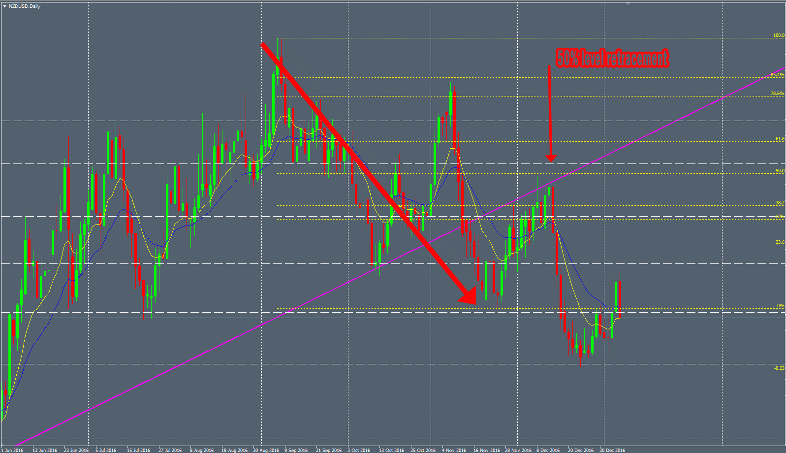
The Fibo ratios showing the high confluence of this spot :

NZDUSD-level-1

And the lovely Price pattern as a perfect bearish Engulfing bar :

NZDUSD-level-2

This kind of structure delivers very good winratio over the time. But the drawback is that it does not print very often on the charts of course.


“Pinch” Structure

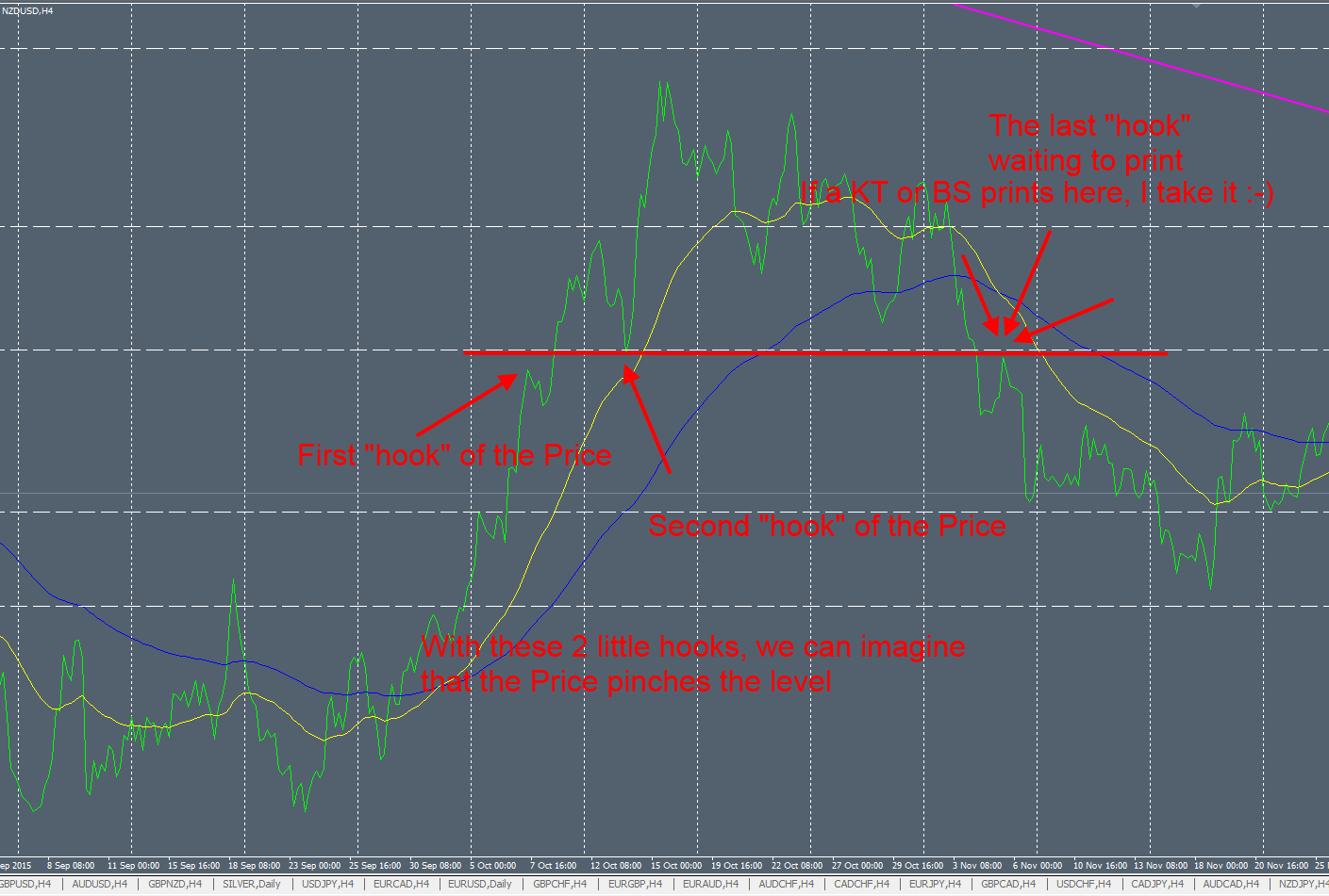
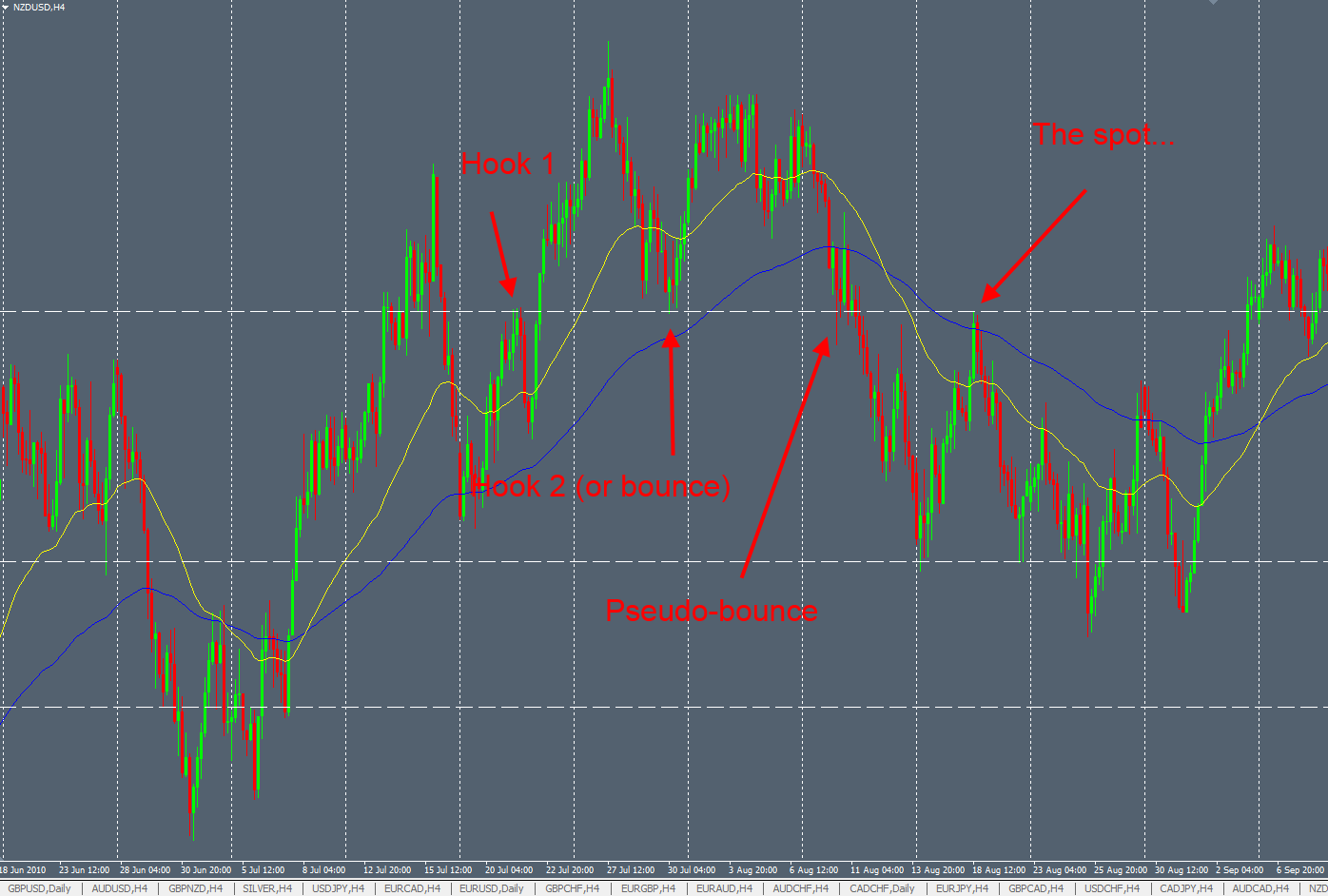
This other structure is pretty interesting and needs more discretional analysis. This a retest of a significant horizontal level in a specific Price context. To identify this kind of horizontal level, you have to analyze before the interaction with the Price on it to see a “Pinch” of the Price.

On the following picture, in line mode to see it clearly, we can see that the Price printed some “hooks” to confirm this level. After that, the Price bounced on it and once it broke, when can wait for a bearish sign and nice Price pattern as usual :

pinch-1

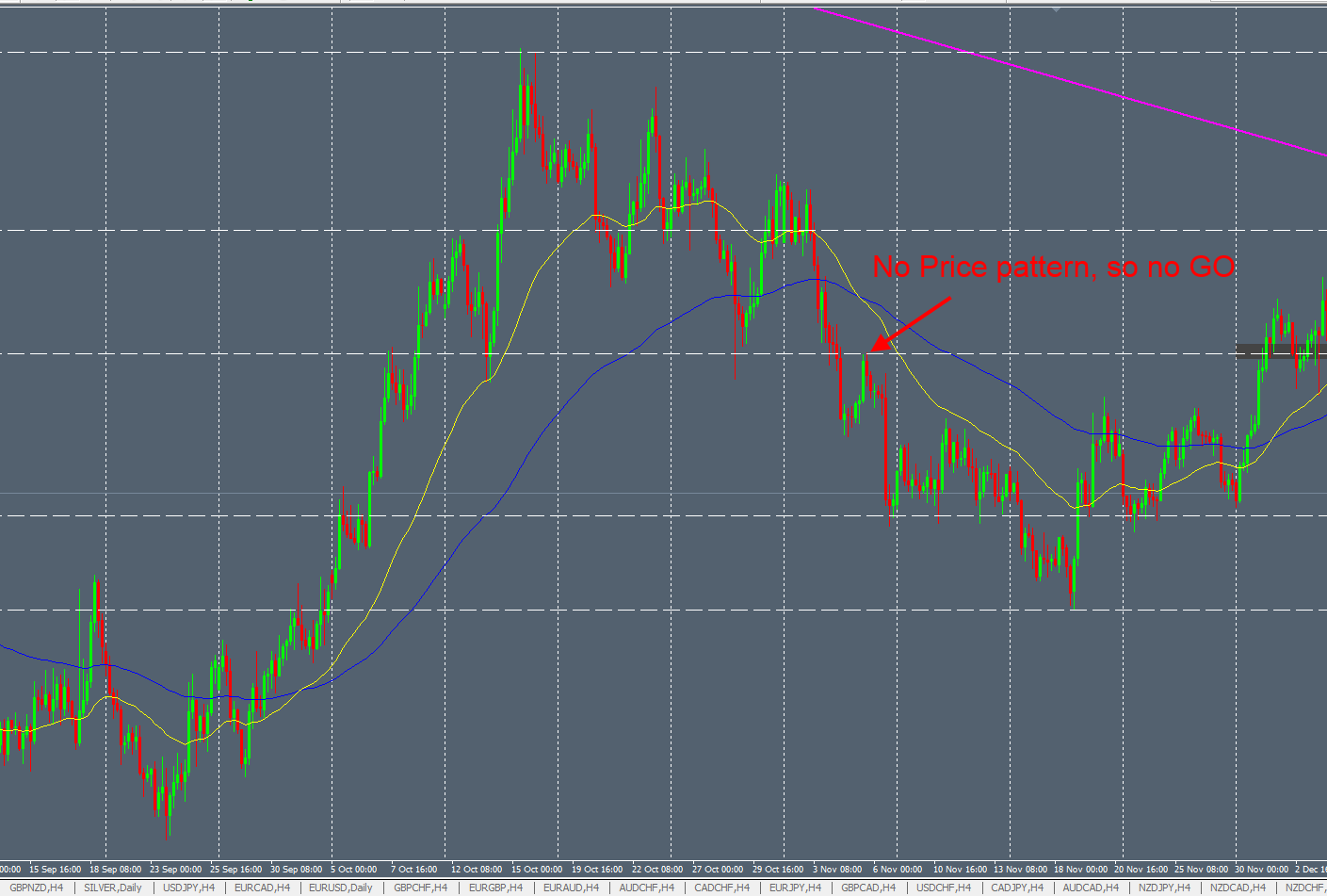
Some random examples to illustrate because it needs a bit of habit to notice them easily :

pinch-2

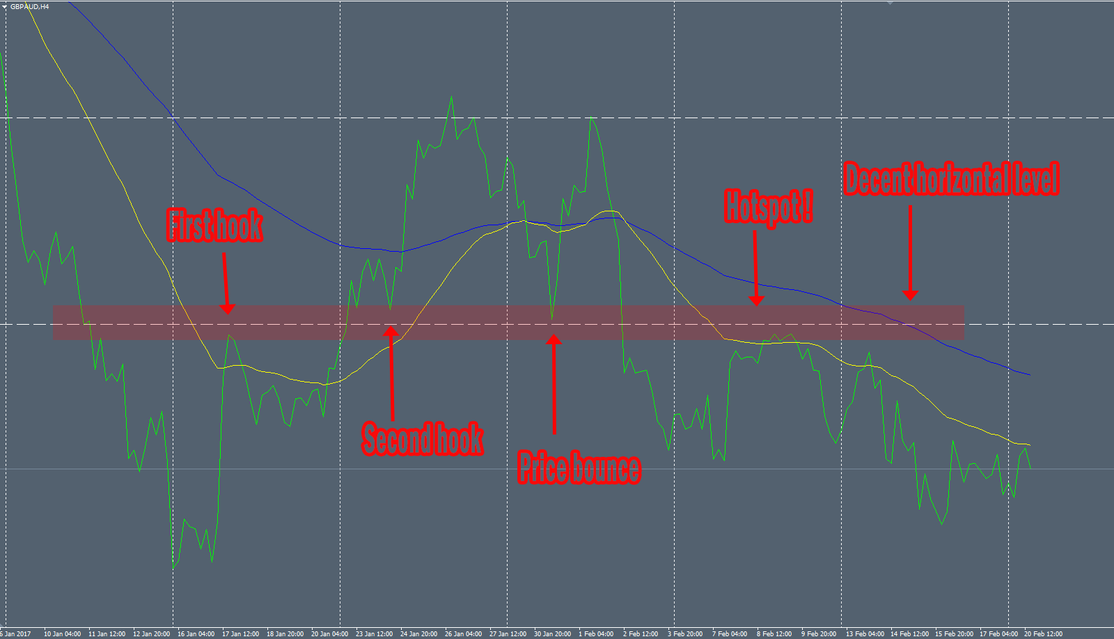
When the Price broke this horizontal level, we will look for a bearish Price pattern once the Price touches it :

pinch-3

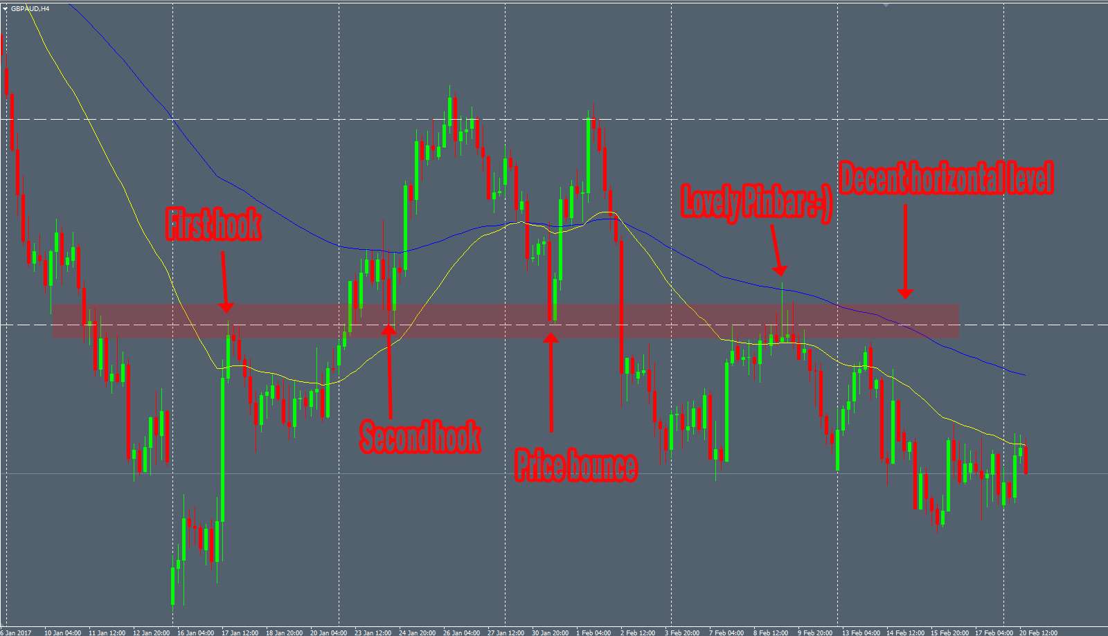
To be more concrete, I took a trade 2 weeks ago on the GBPAUD H4 chart with a lovely Pinbar within a very nice “Pinch” structure. Here is the chart in line mode to see clearly the spots :

pinch-4

And this great bearish Pinbar on the H4 chart offering a very good trade opportunity :

pinch-5


“Triple tap” Structure

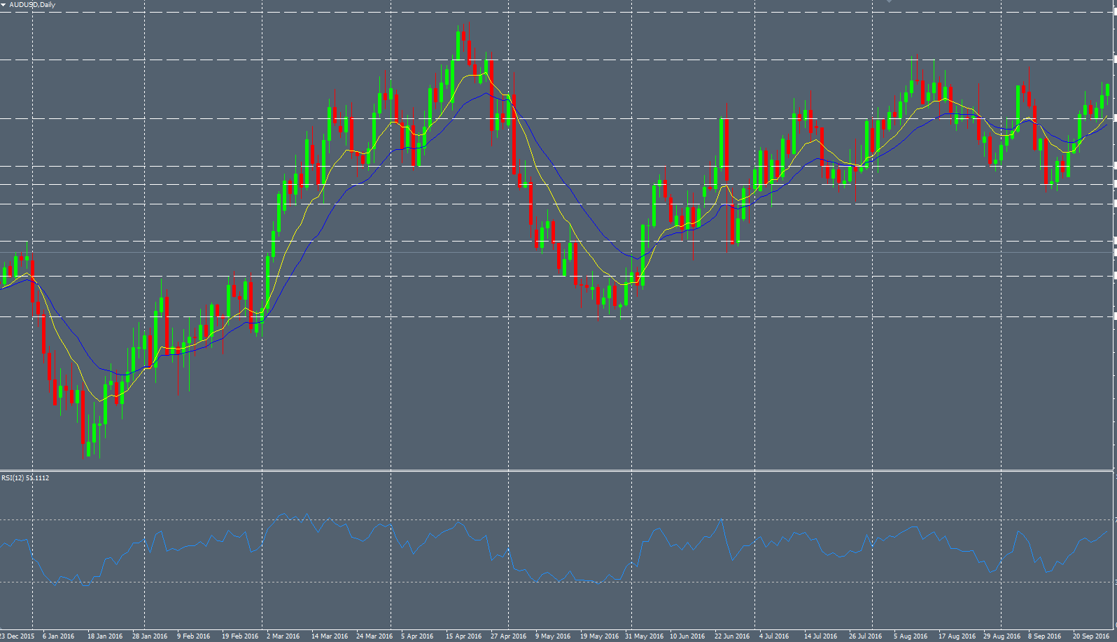
A triple tap structure is composed by 3 legs of higher highs (or 3 lower lows in a bullish setup). The reliable “Triple tap” structures are more rare and can be used with a oscillator indicator (like RSI or Macd for example) to notice divergence between the both. Here is an example on the AUDUSD with the divergence :

triple-tap1

triple-tap2


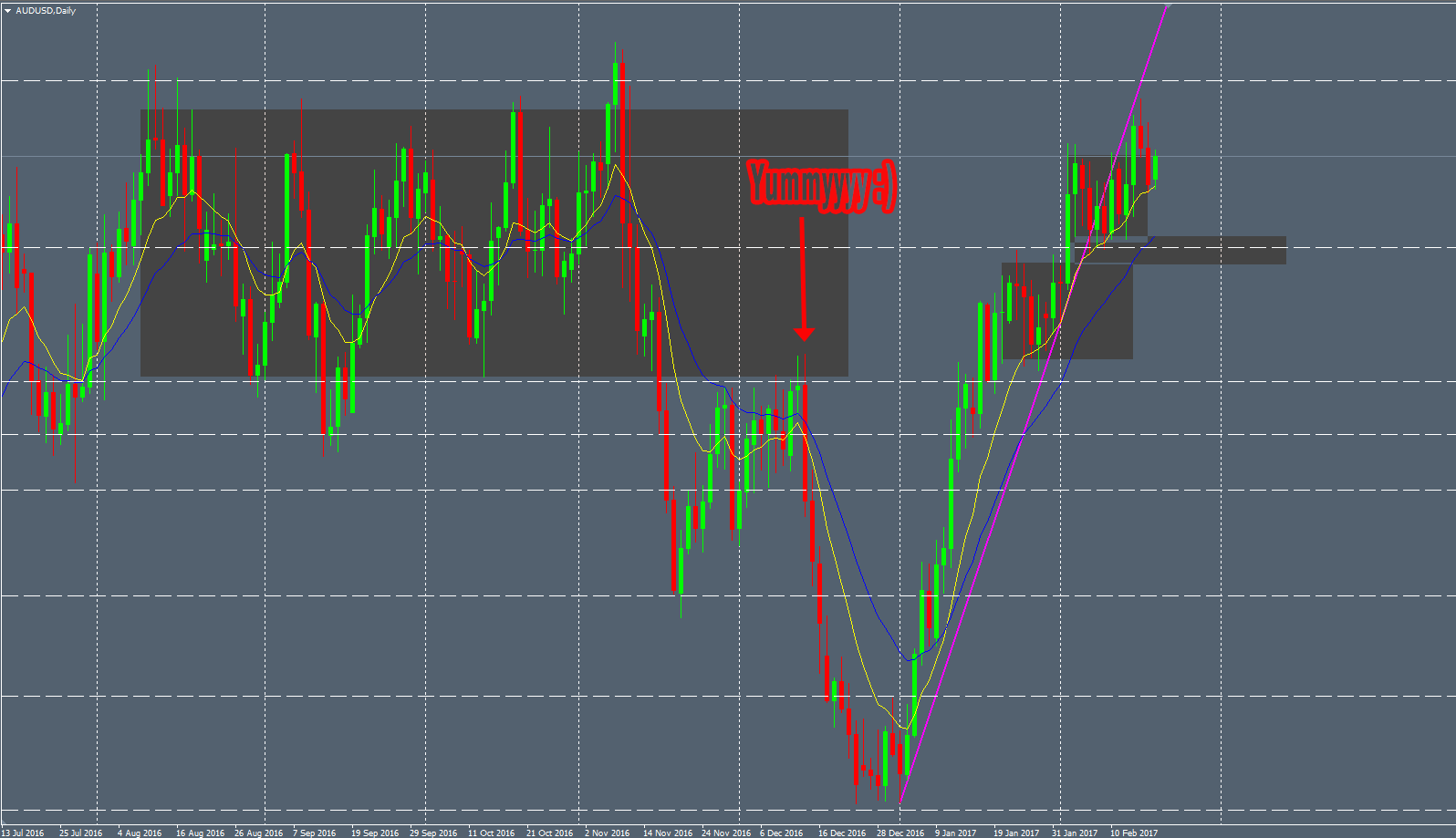
“Consolidation retest” Structure

This one is pretty easy to detect when you see ranging Markets. Every Price moves follow some basic rules as the impulsive move, retracement move and consolidation move. A Price can’t move into one direction without having a rest, time to time. This rest is called consolidation (or ranging Market) when the Price goes in a specific range. In this period of time, you can easily draw “boxes” to frame the Price like we can see below:

retest-1

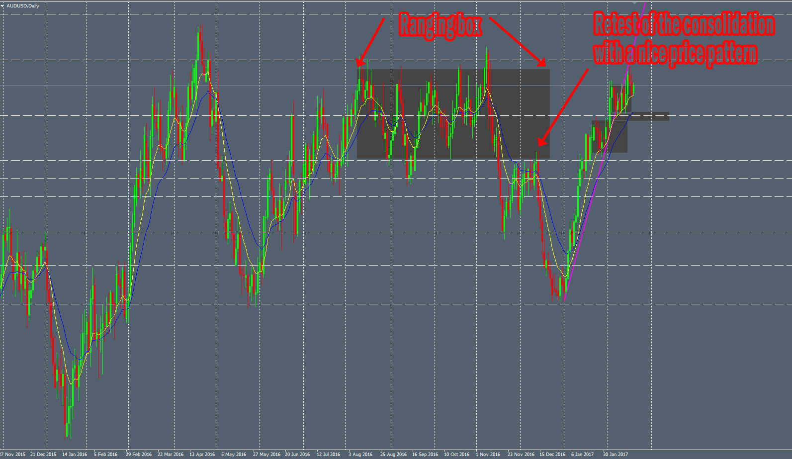
After that, you have to wait for the Price to break this consolidation “box”. Once the Price broke it above or below, you can seek for retest of the box with a nice price patter. This is what happened with my AUDUSD Daily lovely Engulfing bar last year:

retest-2

The consolidation can be more or less obvious to see. If the consolidation area is not very clean and clear, it’s better to avoid it.

Others structures…

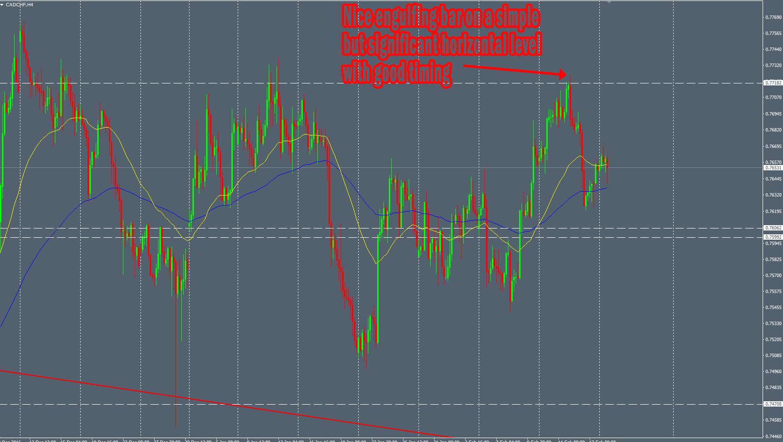
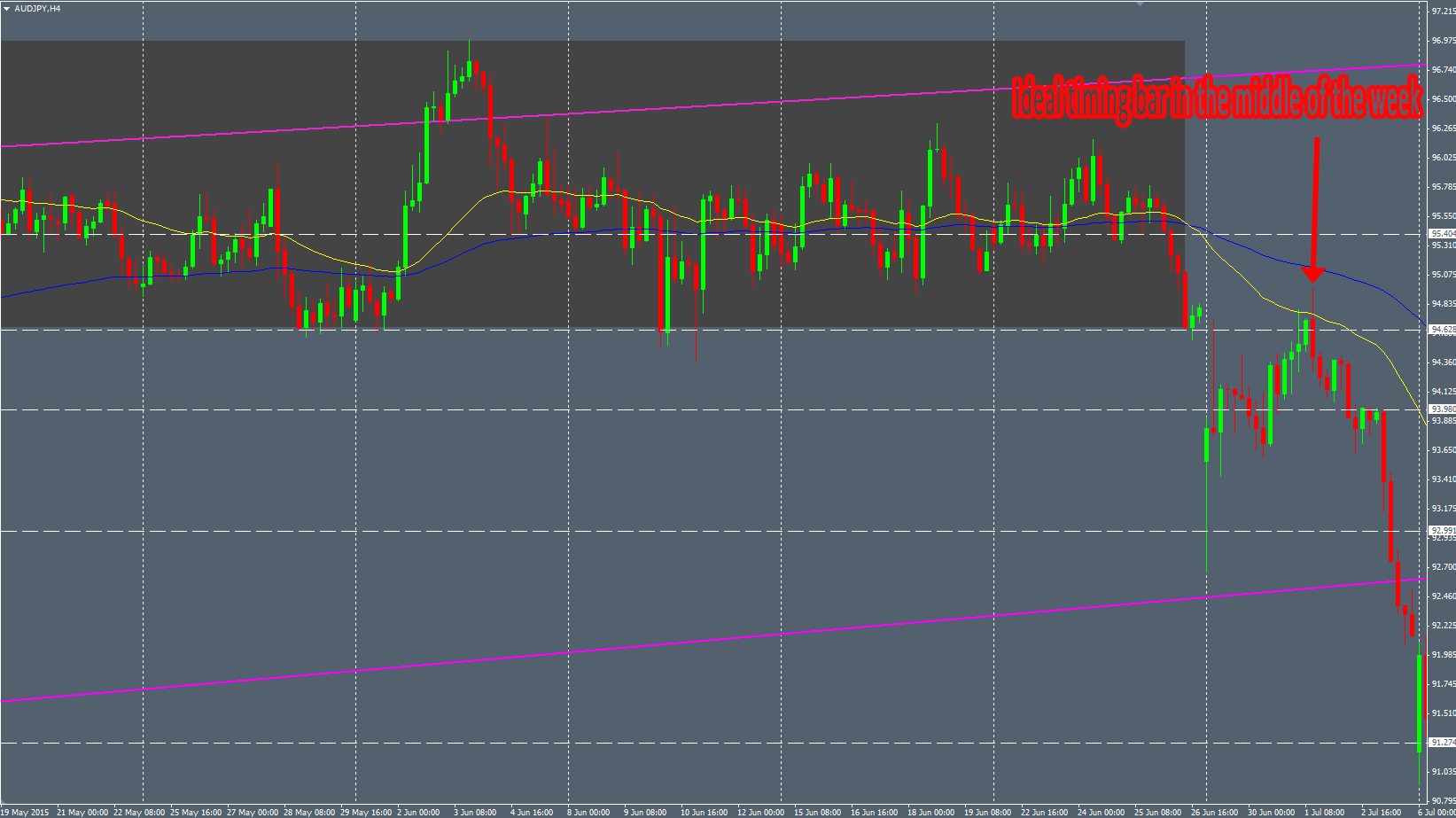
The previous Price contexts are my favorite ones. However, sometimes you can see very good Price Pattern in more standard structures. For example, I took a trade last week on the GBPAUD H4 chart on a significant horizontal level. The Price Pattern was very nice to see and the timing (the middle of the week) was almost perfect :

other

We can see other classical structures, like “Double Top”, “Double Bottoms” or “Head&Shoulders”. Finding a reliable Price Pattern within these efficient Price structures can be rewarding too. Add a salt of timing idea and you can obtain good probabilities on your trade.

To summarize : If you trade the Price Action without taking in account its context, you can have hard times. It’s always important to have an overall picture of the Price by zooming out and stepping back from your charts. This is where the discretional analysis of the trader comes into play.


Insight

header

Since I remembered that I had a website, I wanted to share an indicator with my single and unique visitor in order to thank him to place great hopes on me to publish a new article browsing this ugly and empty website every single day… That’s so touching… Thanks my dear little Google bot !

In fact, that’s pretty strange because I’m supposed to be a “Naked trader”. “Naked” because I trade without any indicators (not because I trade in brief). So using an indicator on my charts is not expected. However, this indicator is not an oscillator derivated from the Price Action, it’s the Price Action itself shifted in the time. Dear little Google bot, if you read my previous article about the timing, you know that I like to play with the time in order to multiply the opportunities on my charts and find more reliable setups.

It’s a pretty dumb indicator because it’s just drawing Price Action by shifting the time period. However, it can be useful if you want to see the Price Action differently, from different perspectives. Instead of looking for only one pattern at a given time on a given location, you can see the price reacting in a more accurate way than usual.

I had this idea when I was standing on my toilet to hang a clock, then I bumped my head and the flux… No… I’m wrong… I had this dumb idea when I was using different MT4 candles closing time in order to have more setups with only 1 pair. I used the standard NY closing time and the midnight EST closing time. So I decided to do it automatically with an indicator by shifting the time in real-time on my charts.

I’m convinced that the time is an underated component for a lot of trader. We are a lot to look at the levels with attention, to analyze the movement of the Price relating to its value (the Y-axis) but I think the X-axis, the date, the hour, the time is as important as the Price value.

Some traders can argue that the closing time is very important because every traders use the NY closing time and that’s why it’s the only relevant closing time. However, as pure technical traders we can’t forget the first and main principle of the technical analysis :

Everything is in the charts.

The Price is the same everywhere on the charts, no matter the candle closing time. Period.

To be more concrete, here’s an example with a SELL H4-based trade on the NZDCAD I took several weeks ago. I was paying attention to this level because the NZDCAD was almost at its historical higher rate. I was looking for selling it in this area. However, no reliable pattern printed on my standard NY closing time chart :

NZDCAD-1

I was so sad… I was depressed to see nothing on this lovely level. I took few antidepressants and had the idea to use the weird indicator I wrote… And the pattern appeared as if by magic :

NZDCAD-2

Here is the same chart in motion and twerking thanks to this indicator:

nzdcad

This indicator allows to shift the time on H4 and D1 timeframe. The indicator shifts the time based on the H1 timeframe so the H4 charts will refresh 4 times to show 4 shifts. The D1 timeframe will refresh 24 times to show 24 shifts.

Here’s another example on the EURCAD H4 chart :

eurcad

You can define your personal refresh rate if you want by customizing the H4 or D1 delay in milliseconds. In a default configuration, the indicator refreshs H4 every second (1000 millisecondes) and the D1 every 400 milliseconds (because there are 24 refresh…).

To use it, you need to put your current chart in “line chart” mode. After that you click right on your chart and you select “properties”. Then, in the “colors” tab, you select the “none” color for the “line charts” box.
Finally, you drag&drop the “Dynamic_Price_Action” indicator. You can customize the color of your candle as you want (the default settings are my default chart colors). Only H4 and D1 timeframes are supported.

You can download this “indicator” here (bugs included for free) : http://s000.tinyupload.com/?file_id=60117540697081890715

If this indicator doesn’t work for you, if you find it useless, if you think this post is useless or even this whole website, feel free to insult me by email. I’ll read this carefully as I have plenty of time.


Timing is everything

header

One of the most common psychological bias in trading is to think that to figure out a complex problem, you have to use complex tools. It explains why the mainstream and loser traders are mainly using such weird indicators like RSI, MACD, Bollinger Bands, … Displaying complexity on your screen with a lot of indicators can be comforting by having the feeling to have an edge on the complex Market with complex trading system. Thus, you can think you understood something that nobody else did. Some secret formula by blending different technical components.

This psychological bias can lead to such beautiful and charming screens gallery like this :

TradingScreen img_5503f27355d0d forex-indicators

Better to see that in a museum… You can have a lot of fun and artistic ideas by browsing the forums of the famous Forexfactory website. Often, the logos of the trading systems are as beautiful as the graphical indicators. To be honest, there are others psychological bias involved here. But it’s another topic.

No suspence here : the indicators are laggy and almost useless.

Raw informations of the Market

Instead of seeking the information into complex and ugly indicators, we can start by asking these questions : what is the raw data printed on your charts ? What is the source of everything when you look at your chart ?

And we can use the same point of view as usual : if the mainstream traders are doing something, let’s do the contrary. We will print nothing (not even the price data) on our trading screen :

blur

Why displaying this stupid screen ? Because, we can see the 2 most important informations of the Forex : the Price Action value on the Y-axis and the Time on the X-axis. The same with the Price Action candlestick :

noblur

Now you can do yourself a favor : hit the Ctrl+Y under Metatrader to print the timelines.

timing

Yes, it can sound really dumb, I know. But you’ll see that the printing of these tiny dotted lines can help you a lot to improve the winratio of your trading system… In order to discern the entire specific timing problem, we have to move on another topic.

One of the most interesting statistic in the Forex world

I will not speak about the shitty statistic about the 95% loser traders or another unverifiable stupid statistic. I will explain that you can check by yourself this little but really interesting statistic :

Between 98% and 100% of the candlestick printed on your charts have an open price different to the lowest price for a bullish bar and an open price different to the highest price for a bearish bar.

What does that mean ? It means that the vast majority of the time, the first price move on the Market is the wrong one…

Here is my stupid MT4 Expert Advisor displaying statistical data about the opening and lowest/highest price. You can run it on every pair you want and notice that information : around 99% of the bars on your charts have an open price different to the highest/lowest one. To be more concrete : if you see a bullish bar forming with an open price equal to the lowest period price, you can expect that the price will reverse.

I could write a lot of things about this but we will sum up in order to reuse this information easily. Generally speaking, the very first movements of the candlestick are the wicks, as the last ones. The core body of the candlestick is very often created and generated in the middle of the period time candlestick formation.

Let’s take an example with the EURUSD, last year during May 2014 :

EURUSD-M1-may

It’s the monthly chart of the EURUSD. You can see that this bar was important for 2014 as the price have tanked since this moment. Now, we can “zoom” in by looking at the Daily timeframe :

EURUSD-D1-may

Here is one of your best Forex friend : the previous tiny dotted lines. It’s really interesting to see the price movement inside May bar. We can split this monthly bar in 3 main parts :

EURUSD-D1-May-color

  •  The red area : the price goes up in the very first day of the month
  • The green area : this is the core of the month, all strong price movement is here : SELL
  • The blue area : the price retraces a bit before the month closes

The red period of time shows you that the first movement of the month is not the main one. As a profitable trader using high probability setup, we prefer to catch the main movement of the price : the center of the monthly bar. In order to improve our timing entry on the Market, we can think about taking only the very best setup by entering the market only during these green periods of time : the core of the bar.

Use the time to improve your winratio

The funny fact is that you can use the previous informations on all timeframe because of the fractal nature of the financial Markets. If you like high-probability setups, you can even use it on M30/H1 timeframes. I imagine you know as a trader that it’s better to trade intraday during the London and New-York session as the volatility is more important. This is the same principle : the beginning of the day, the price goes really often in the “wrong” way. It’s called the asian session. The main activity, the core of the day is during the London session and London/New-York session overlap. And the end of the daily bar, it’s the end of New-York session, often against the previous price action activity.

To demonstrate this I choose the current Daily EURUSD candle formation of today (writing article date : July 9th 2015) :

EURUSD-H1

 Sounds familiar ? Here comes the colors…

EURUSD-H1-color

 So maaaaaaagic !

  •  The red area : the Asian session
  • The green area : the London session and New-York start session
  • The blue area : the end of the New-York session

Of course, it’s not an absolute rule or law. The Market will not behave like that every day. But it does it really often and knowing that will provide you an edge.

Depending on your trading style, you can adapt these informations on the timeframe you prefer. Personally, I like the Daily and 4 hours timeframes. Here is how I use this information in my trading process.

Concerning the Daily timeframes setups : I never trade (or very exceptionally) the Monday and the Friday. Why ? Because it’s during the red and the blue period of time. It’s often retracement period of times with a lot of wrong signals. The Monday and the Friday are very often wicks of the Weekly candles. Here is an example with a previous GBPUSD trade I took during  February :

GBPUSD

The main movement of the week is done the Thursday. You can see the strength of this reaction the next weeks…

You could argue that I’m missing some trade opportunities by avoiding trading 2 days per week. You are right. But if you backtest heavily, you will realize that it’s more profitable to avoid some loser opportunities these special days than taking all opportunities of the week, including the winners and the losers.

The last example is on the 4 hour charts. This is the trade I took last week, it was an easy & quick trade :

AUDJPY-H4

This was a perfect timed setup for me because this H4 engulfing bar printed in the middle of the week, the Wednesday. You can see where is the price now… By trading only the Tuesday, Wednesday and Thursday on my H4 charts, I drastically improve the winratio of my trading system.

To summarize : if you want to take high-probability setup, use the time. It’s as important as the price itself. And avoid the very beginning and the very end of each period of time you are trading.